Improved Emergency Room Workflow Efficiency Through Real-Time Patient Visibility.

OverviewRebuilt emergency room workflows with centralized patient tracking, role-based dashboards, and faster access to critical medical information.
My roleUI/UX Designer
Team
1 Designer (Me)1 PM1 Front End1 Back End1 QA
TimelineQ2 2024 - 4 Months

What's ER Management system?

This is a SaaS-based emergency room management platform designed to streamline and digitize the complete ER workflow — from triage to discharge.

The system helps medical teams collaborate efficiently, make faster decisions, and reduce patient waiting time in high-pressure emergency care environments.

Built specifically for hospital ER departments, the platform focuses on improving operational clarity, real-time coordination, and patient flow management across multiple stakeholders.

But how did this project land on my desk?

  1. 1

    A system already existed

    The ER already had a working platform used across multiple hospital workflows.

  2. 2

    The redesign opportunity came in

    The goal initially was to improve and modernize the existing experience rather than rebuild everything from scratch.

  3. 3

    Started exploring the current product

    I began by going through the existing screens, workflows, and role-based journeys to understand how the system functioned in real hospital scenarios.

  4. 4

    Reality looked very different

    The deeper we explored, the more we realized that every role interacted with the platform differently depending on the urgency of the situation.

  5. 5

    Conversations changed the direction

    Discussions with doctors, nurses, and admins gave a completely new perspective on how emergency workflows actually operate in real time.

  6. 6

    That became the starting point

    Instead of approaching it as a visual redesign, the project evolved into redesigning how emergency care workflows are experienced digitally.

Who are our Users?

The platform was designed for multiple stakeholders working inside the Emergency Room ecosystem. Each role had different responsibilities, priorities, and interactions within the workflow.

Triage Nurse

Handles patient prioritization and initiates the ER flow.

Resident Doctor

Manages assessments, treatments, and patient progress throughout the ER journey.

ED Consultant

Reviews clinical decisions and validates discharge readiness.

Let's find out the problem

To identify the common and important problems to focus on, we used two approaches:

  • We spoke with the stakeholders actively involved in the Emergency Room workflow to understand how the system was being used in real clinical scenarios.
  • We conducted a self-evaluation to validate their feedback.
User interviews
Self evaluation

Common and most important points we have to focus

Research with users

We conducted in-person interviews with doctors, nurses, and ER staff to understand how emergency workflows were handled in real hospital environments.

These discussions helped us learn how different stakeholders interacted with the system during high-pressure situations and how coordination happened across the ER journey.

To understand real ER workflows better, we conducted in-person interviews with doctors, nurses, and ER staff about their day-to-day experience with the existing system.

Key questions we asked our Users

  1. 1.How do you currently manage patients during peak emergency situations?
  2. 2.Which part of the existing workflow feels the most time-consuming or difficult?
  3. 3.Are there situations where you need to depend on verbal communication instead of the system? Why?
  4. 4.What information do you need immediately while handling a patient in the ER?
  5. 5.If you could improve one thing in the current system, what would it be and why?

Some honest answers from our users

  1. 1.Triage Nurses — “Frustrated by delays caused by disconnected systems.”
  2. 2.Resident Doctors — “Carried out assessments using the mobile app, but had to communicate updates verbally.”
  3. 3.ED Consultants — “Responsible for final discharge validation. Often lacked context due to missing or poorly formatted assessment summaries.”

Self evaluation

This exercise focused on Heuristic analysis for the current product. I reviewed the major journeys, user flows, and interface, assessing its compliance with the heuristics and noting any areas for improvement.

The focus is on identifying usability problems and providing recommendations to enhance the overall user experience.

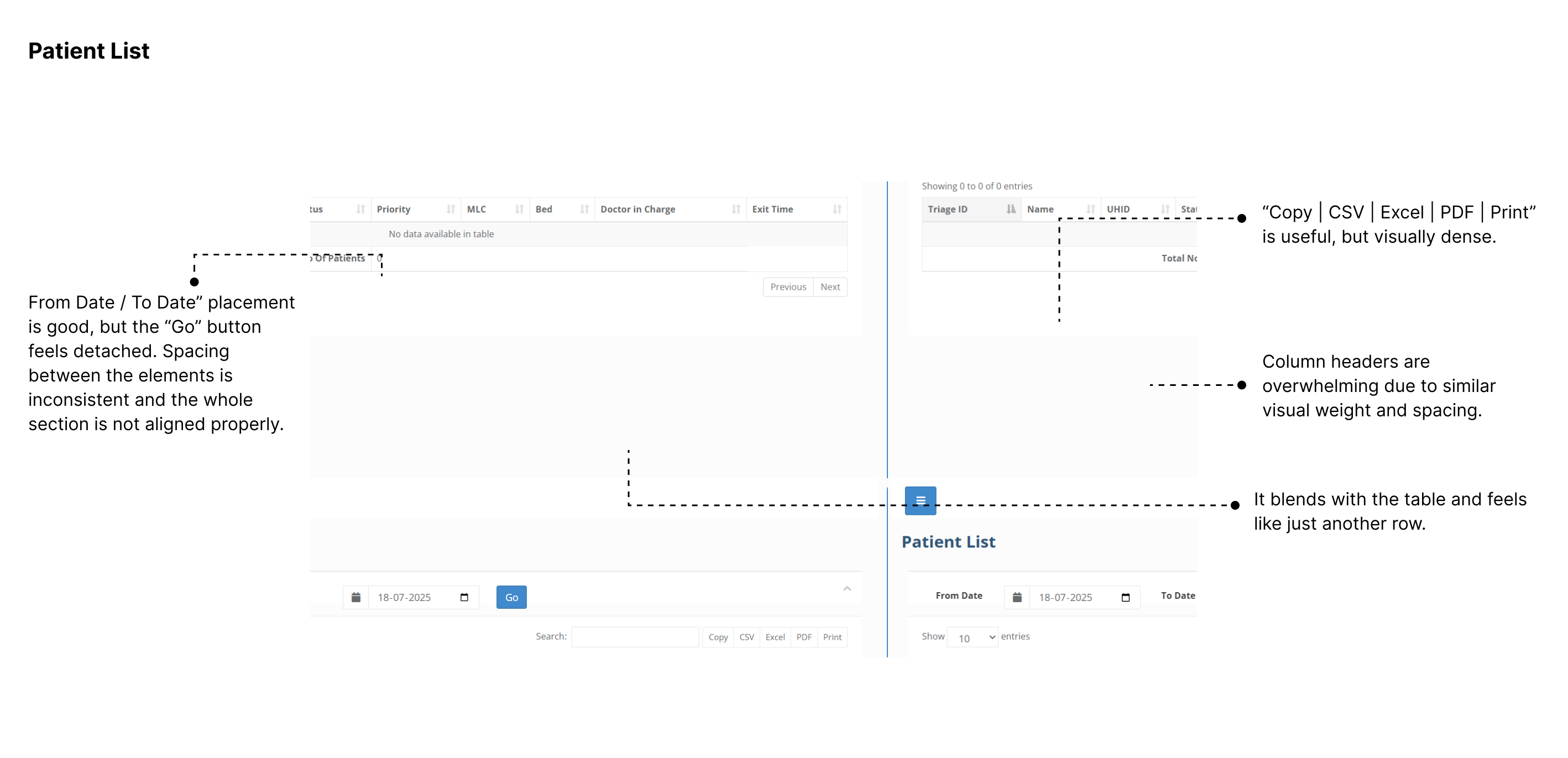
Heuristic evaluation findings, part oneHeuristic evaluation findings, part two

The current design appears limited in terms of screen coverage, suggesting that the application lacks a comprehensive user experience approach. Rather than being built around real user needs or workflows, the interface feels more functional than intentional, with several interactions and layouts lacking the polish and structure of a user-centered design process.

Experience Mapping

Mapping out the current experience of key roles during a patient's ER journey — from entry to discharge — helped us identify where confusion, delays, or friction exist.

Triage Nurse

StageActionPain PointsOpportunities for Improvement
No AccessTriage nurse does not use the web app at allCannot view assigned patients, updates, or confirm barcode was scannedRole-based triage dashboard for visibility and queue tracking

Resident Doctors

StageActionPain PointsOpportunities for Improvement
Patient LookupOpens patient list to check assigned or open casesNo clear sorting or filtering by urgency, status, or time assignedSmart filters (e.g. “My Patients,” “Pending Assessment,” “Discharge Due”)
Assessment ReviewNeeds to revisit what was recorded via mobile (primary, secondary, tertiary)Mobile assessments are not always synced or structured well in web viewSynced, structured view of assessment sections with timestamps
Discharge SummaryFills in or completes summary for hand-off to consultantCannot view the discharge summary filled in the mobile appPre-filled discharge template + guided checklist (meds, labs, diagnosis, etc.)
Vitals MonitoringReviews patient's vital signs during stayVitals may be shown in raw logs or not visualized wellTimeline-based vitals dashboard + alerts for abnormal values

ED Consultants

StageActionPain PointsOpportunities for Improvement
Patient Lookup / Patient AccessUses basic list or lookup to find patientCannot filter by pending approvals or urgency“Pending Consultant Review” tab with status & priority filters
Discharge Summary ReviewUsually does this on mobile, not on webIf done on web, discharge is unstructured and hard to skimSynced, structured summary view (segmented by diagnosis, meds, notes)
Discharge SummaryFills in or completes summary for hand-off to consultantFree text entry, no intelligent structure, re-entering known dataPre-filled discharge template + guided checklist (meds, labs, diagnosis, etc.)
Vitals MonitoringReviews patient's vital signs during stayVitals may be shown in raw logs or not visualized wellTimeline-based vitals dashboard + alerts for abnormal values

Defining Problem

Through experience mapping, stakeholder interviews, and research, we identified multiple friction points that limit the current web app's effectiveness within the ER environment.

⚠️

No real-time visibility of patient flow.

⚠️

Disconnected mobile & web ecosystem.

⚠️

Static and shallow dashboards.

⚠️

Unstructured documentation workflows.

Final Designs - Triage Nurse

Triage is the first and most critical step in the ER journey. The triage nurse plays a vital role in assigning patient priority and initiating the ER flow by generating a unique barcode identity.

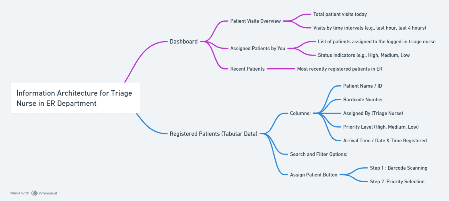
Information Architecture - Mind Map

Before diving into visuals, mapped the core touchpoints and actions the triage nurse needs to perform. Since triage nurses only use the mobile app, the design had to be fast, scannable, and minimal — enabling urgent decision-making at the patient’s side.

Information architecture mind map for triage nurse

Low-Fidelity Wireframes

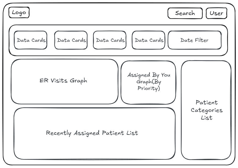
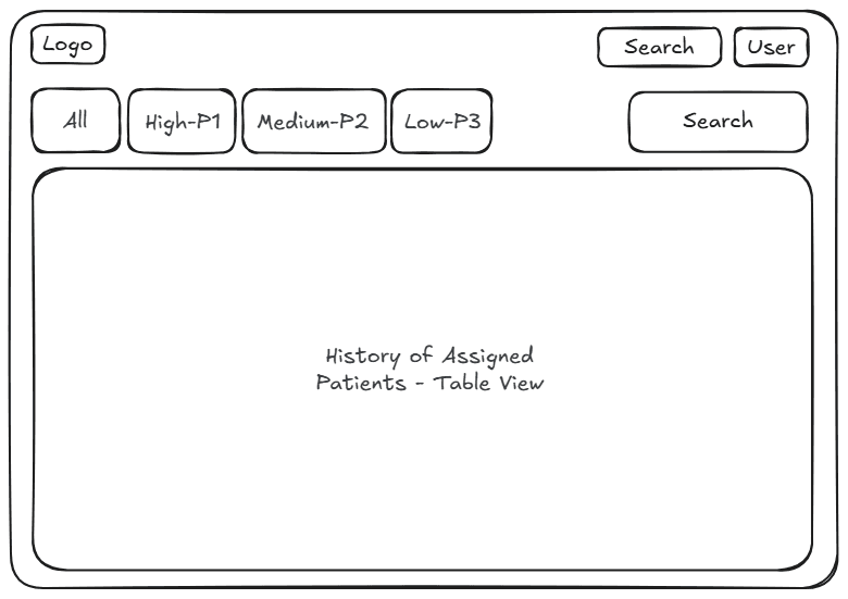
Used ExcaliDraw to quickly sketch out the core flows and layouts, focusing on flow clarity and role-fit design.

Low-fidelity wireframe for triage dashboardLow-fidelity wireframe for triage patients list

Well, can we see how it will be in High Fid?

After validating the low-fis, we brought the flow to life with a clean, intuitive UI. Every component was crafted to reflect the urgency and simplicity expected in a real ER scenario.

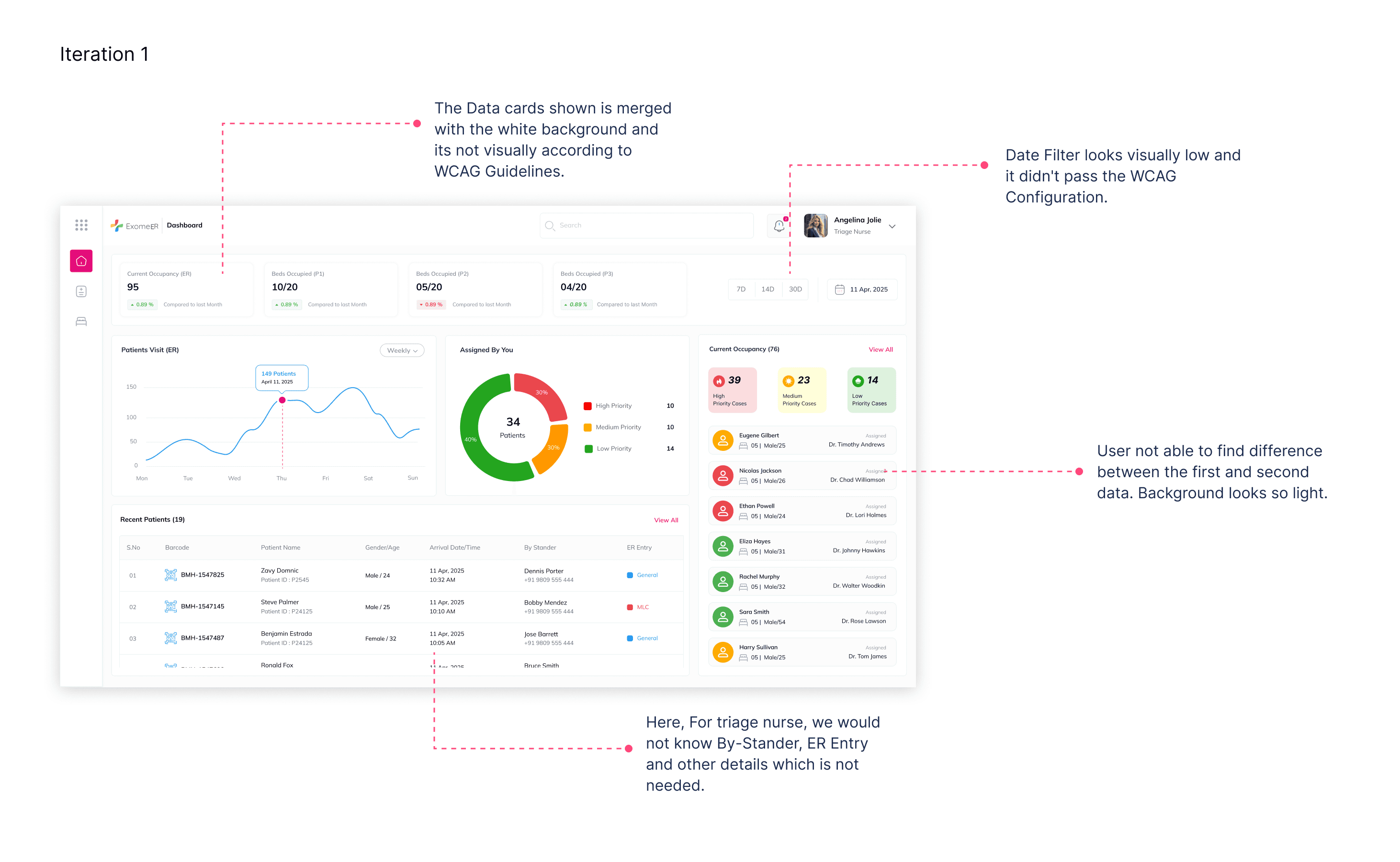
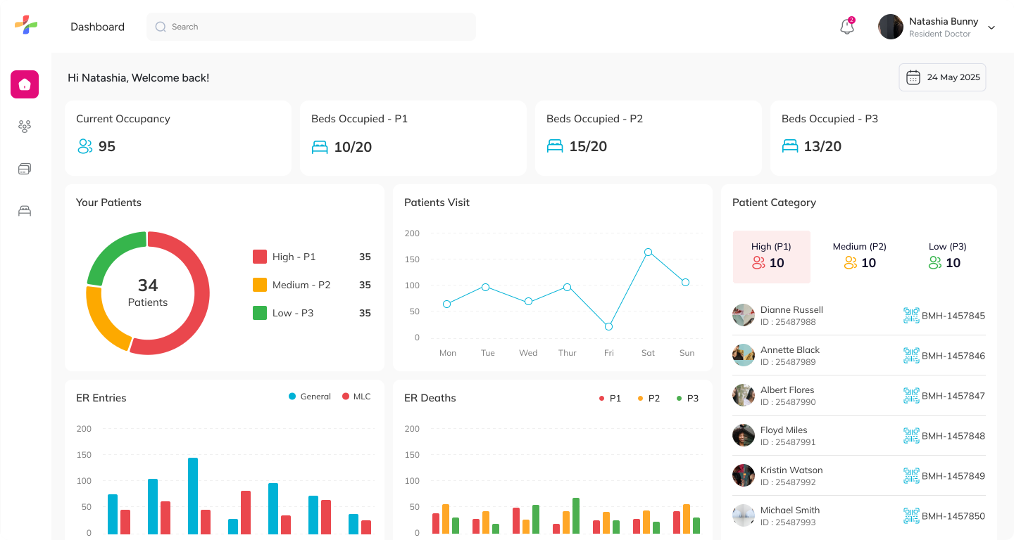
High-fidelity triage nurse dashboard iteration

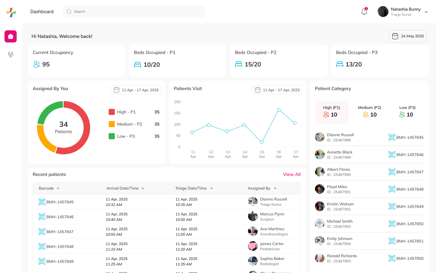
The dashboard was designed to give triage nurses a quick overview of the current ER situation. Important metrics like occupancy, patient categories, assigned cases, and recent patient activity are surfaced in a single view to support faster decision-making during emergencies.

Triage nurse dashboard high-fidelity screen

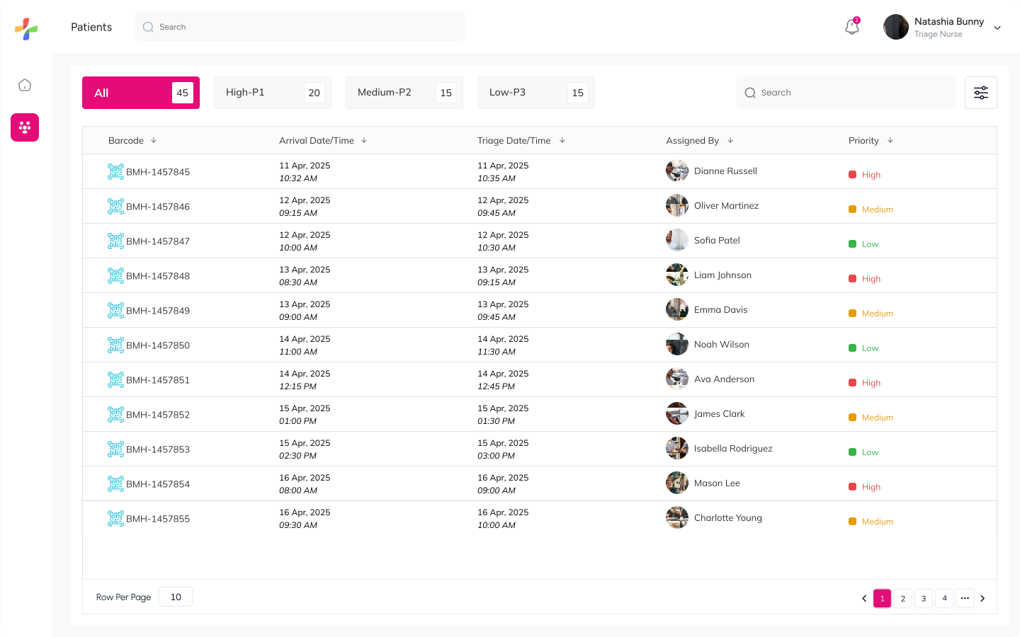
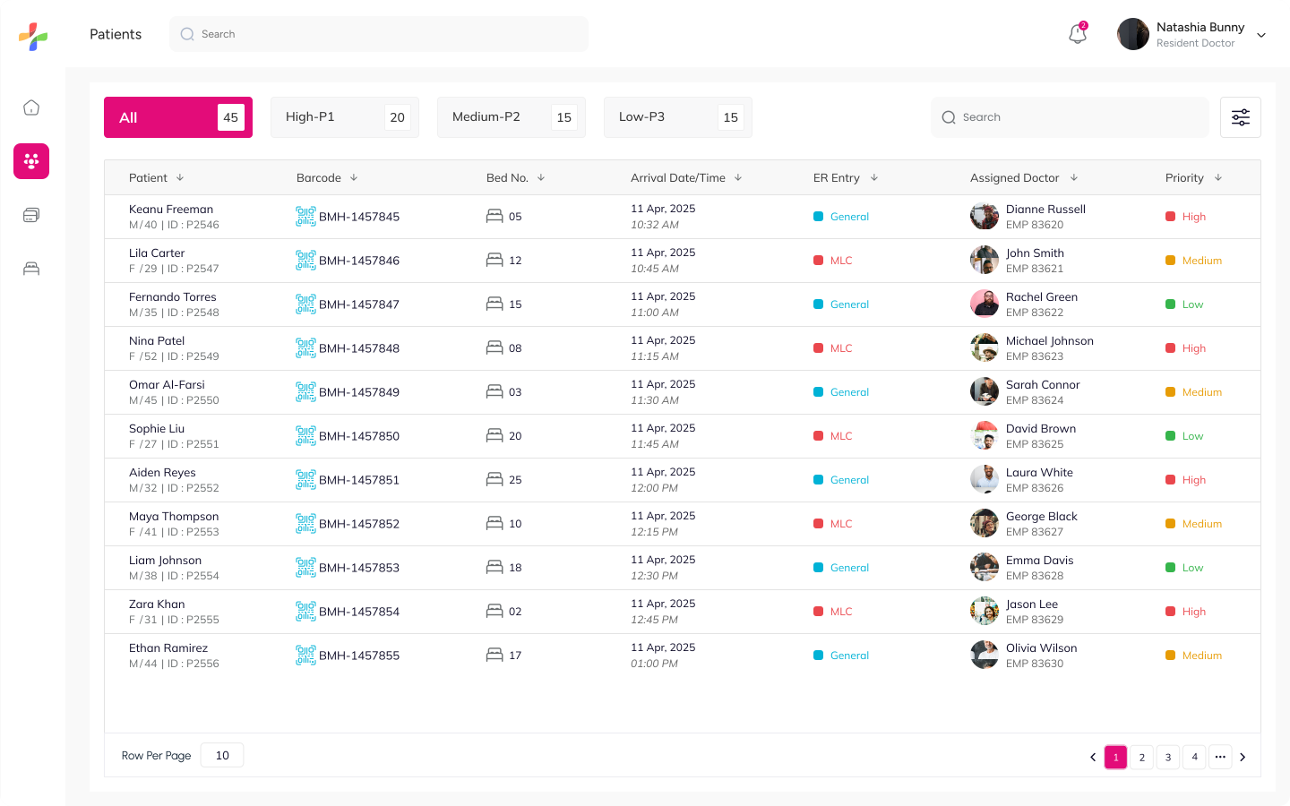
The Patients screen was designed to simplify patient tracking and prioritization. Nurses can quickly identify patients based on urgency levels, view assignment details, and access patient records through a structured and easy-to-scan table layout.

Triage nurse patients list high-fidelity screen

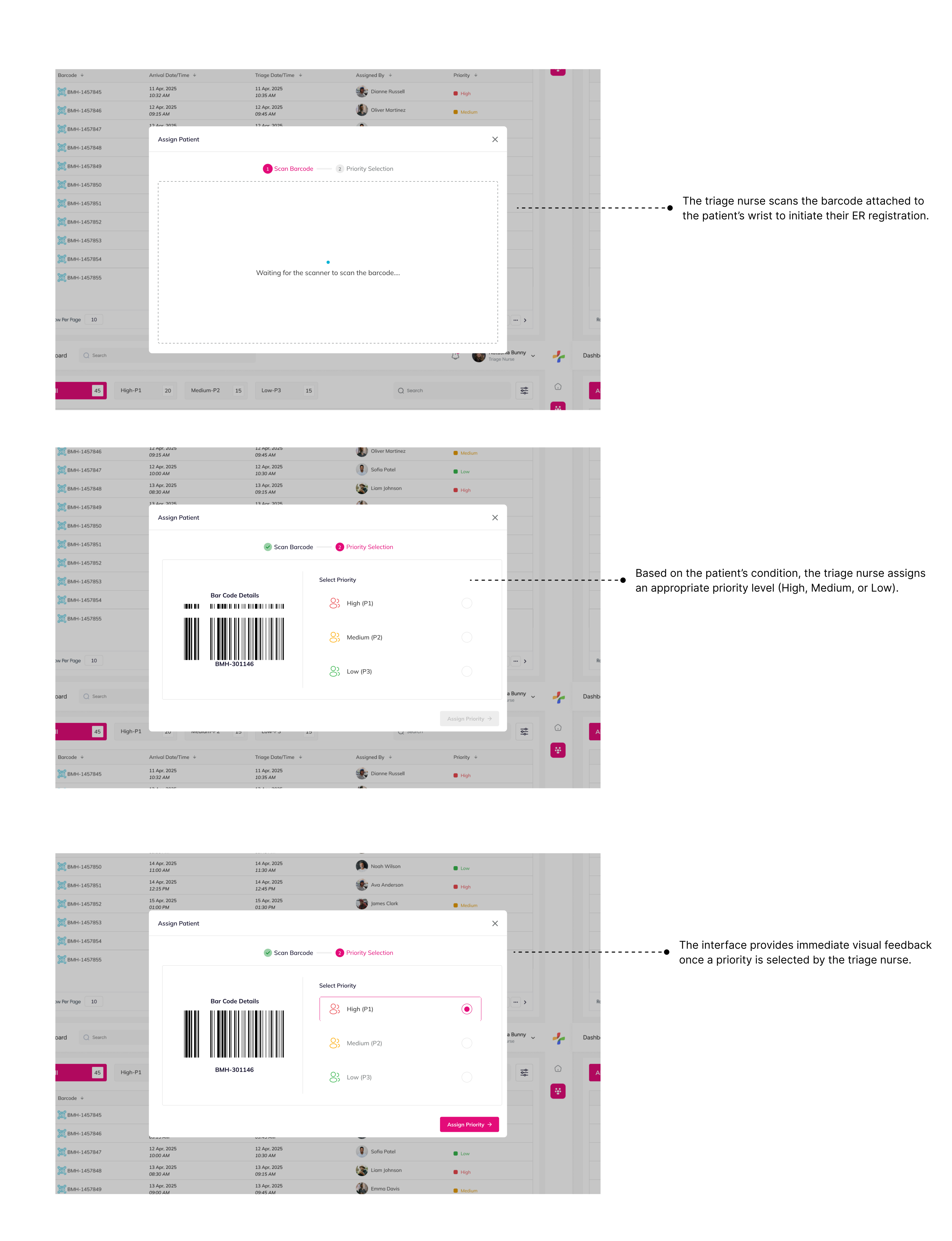
The PA raised a valid concern from the above screen about what happens if there’s a failure in scanning the barcode & assigning the patient’s priority via the mobile app.

💡 In such cases, we should enable a fallback user flow where the triage nurse can perform barcode assignment and set patient priority directly from the web interface. This ensures that even if the mobile device fails or scanning isn't possible, the triage process can continue seamlessly without delay.

Fallback triage flow screen

Final Designs - Resident Doctor

The resident doctor is responsible for conducting primary, secondary, and tertiary assessments of patients in the ER. This role is critical in deciding the patient's course of treatment — whether it involves lab tests, procedures, medication, or discharge. Their actions and decisions form the backbone of the ER flow, bridging diagnosis and resolution.

Information Architecture - Mind Map

Before moving into screen design, we mapped the key workflows and decisions the resident doctor needs to make. Since most of their actions take place via the mobile app, the user flow was designed to support multi-step assessments, easy access to vitals, and a clear path to ER Exit.
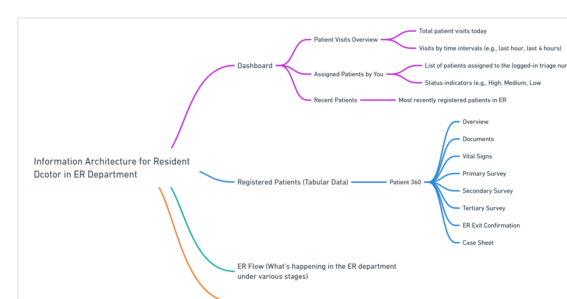
Resident doctor information architecture mind map

High-Fidelity

A clean and focused web interface was designed for resident doctors to streamline key tasks such as reviewing vitals, documenting assessments, and completing discharge summaries efficiently in a high-pressure ER environment.

Resident doctor dashboardResident doctor patients view

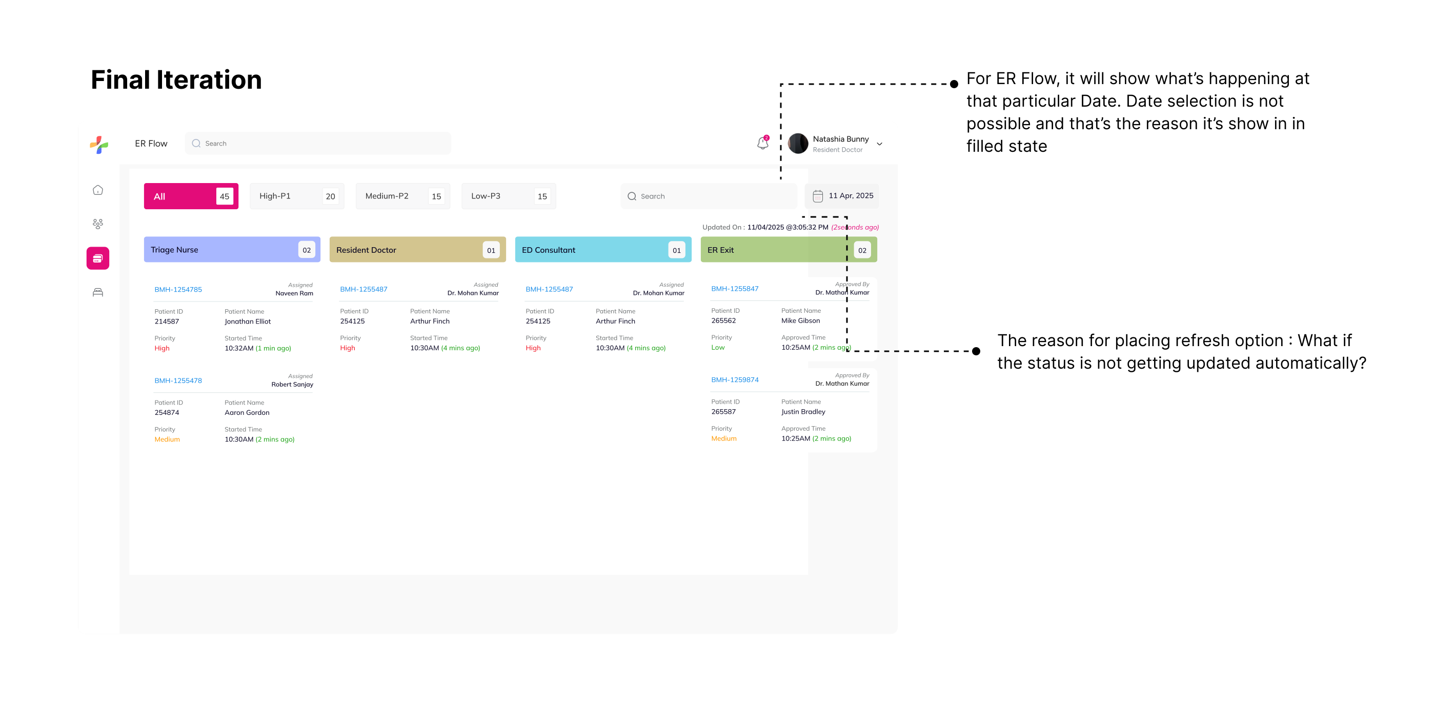
ER Flow

The interface supports the complete ER flow, guiding resident doctors through each critical step — from initial assessment to patient discharge. The flow is designed to mirror real-world decision-making while ensuring medical data is captured consistently.

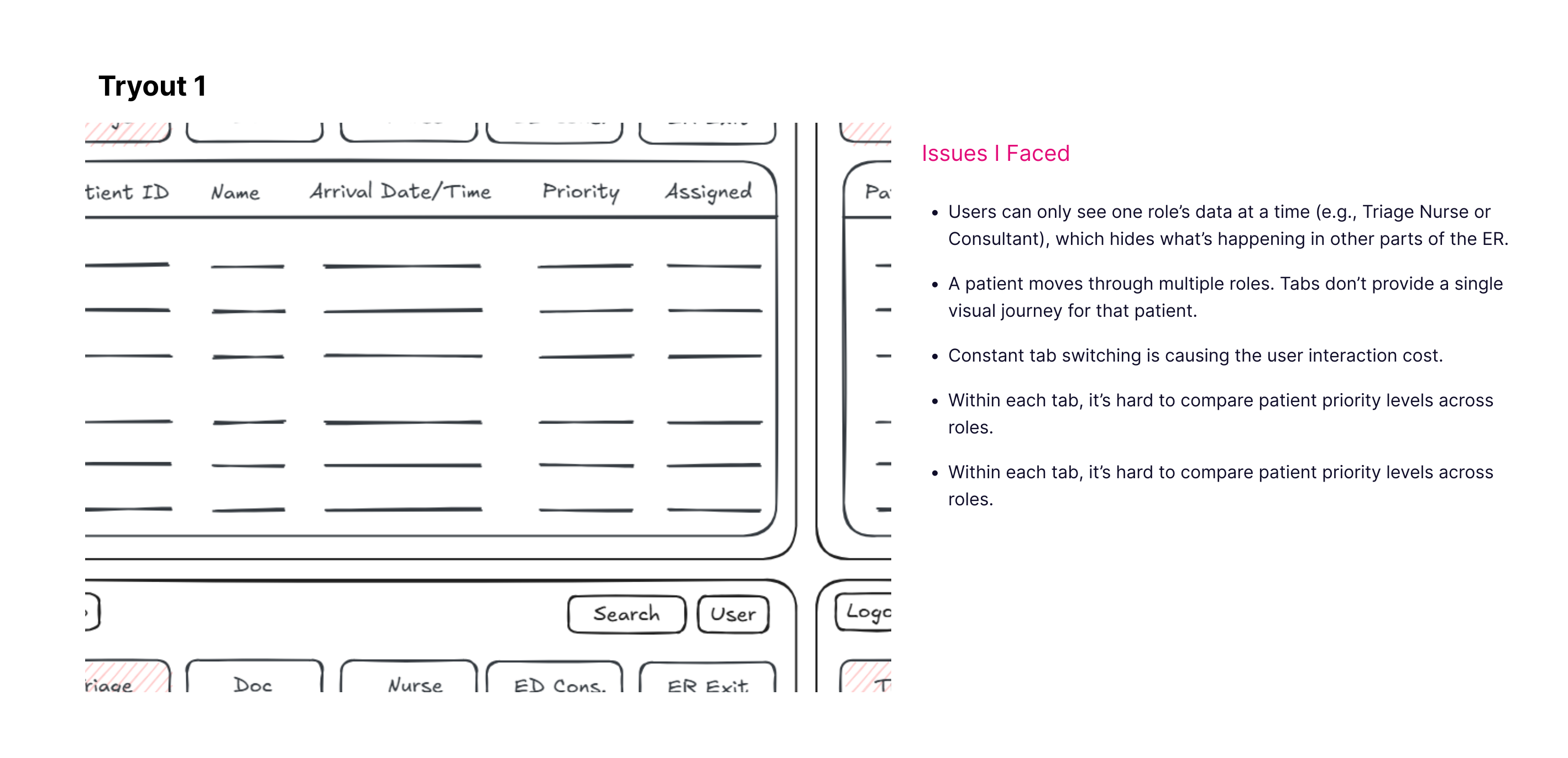
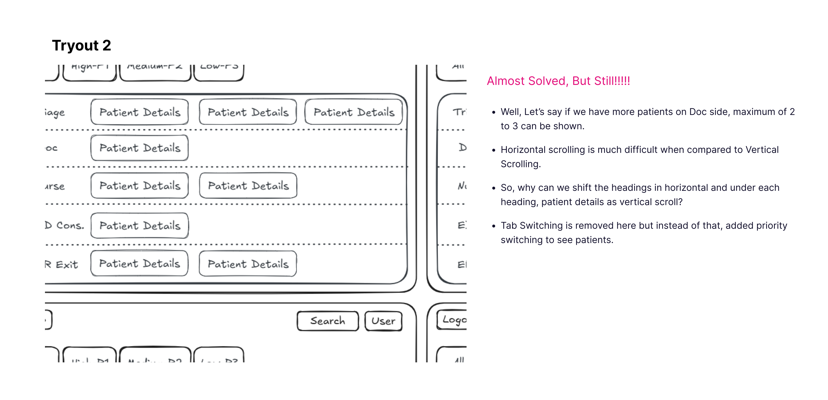
ER flow iteration 1ER flow iteration 2Final ER flow

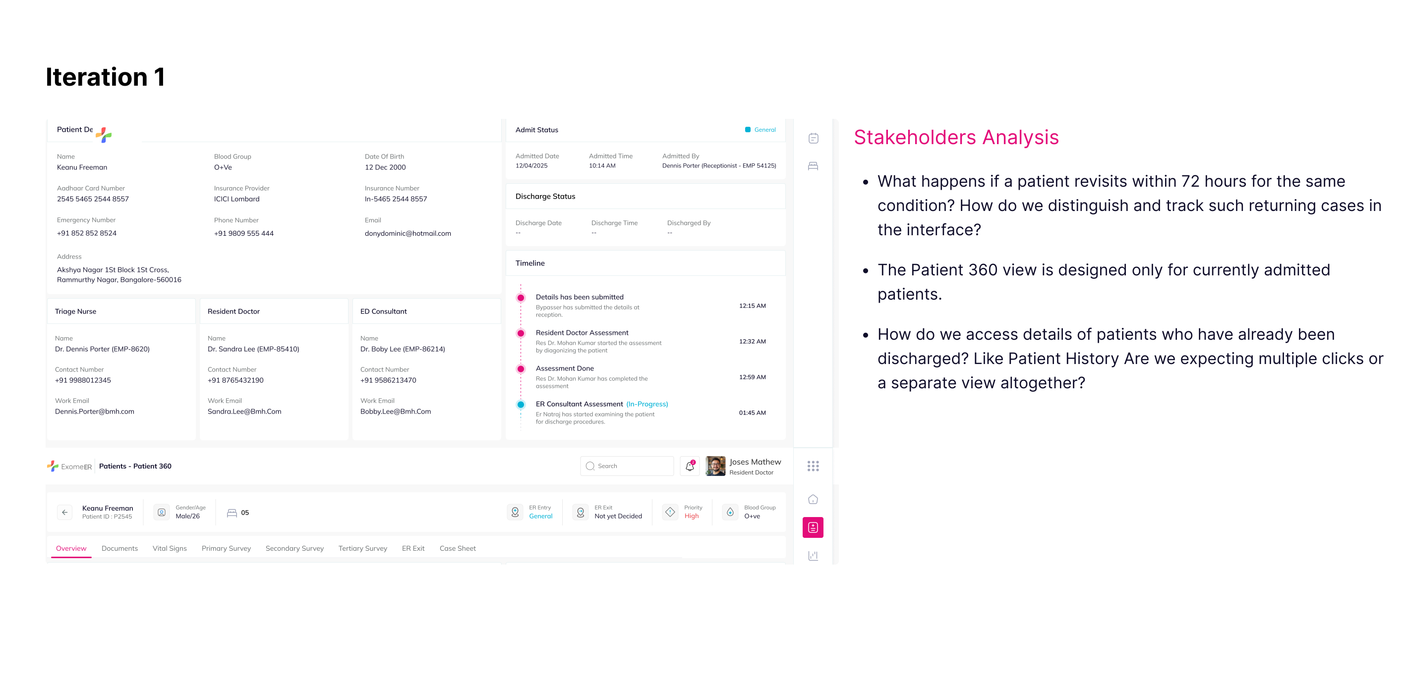
Patient 360

In critical care environments like the ER, fragmented information can lead to delays or miscommunication. To solve this, we introduced Patient 360—a centralized view that combines all relevant patient information in one place.

💡

Why is it needed?

  • ER teams often struggle with jumping between different screens or systems to check vitals, past assessments, lab reports, and procedures.
  • With increasing patient load, speed and clarity become essential.
  • Doctors need context at a glance before making time-sensitive decisions.

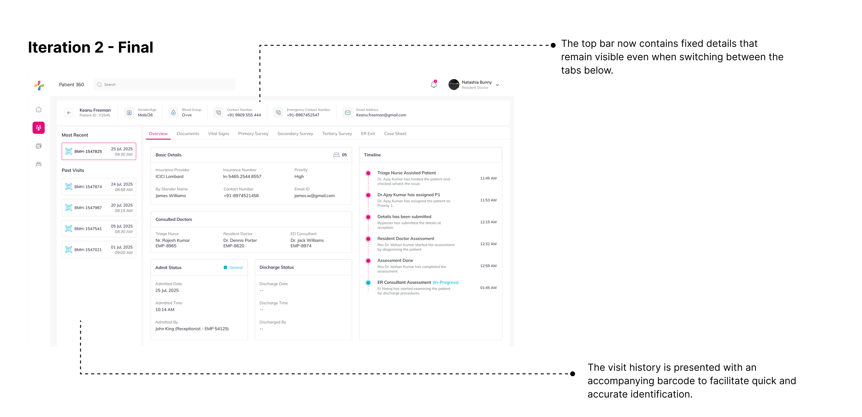
Design is never perfect in the first pass. Through multiple rounds of feedback, stakeholder reviews, and usability validations, we arrived at a solution that balanced clarity, speed, and clinical relevance.

Patient 360 iteration 1Patient 360 iteration 2

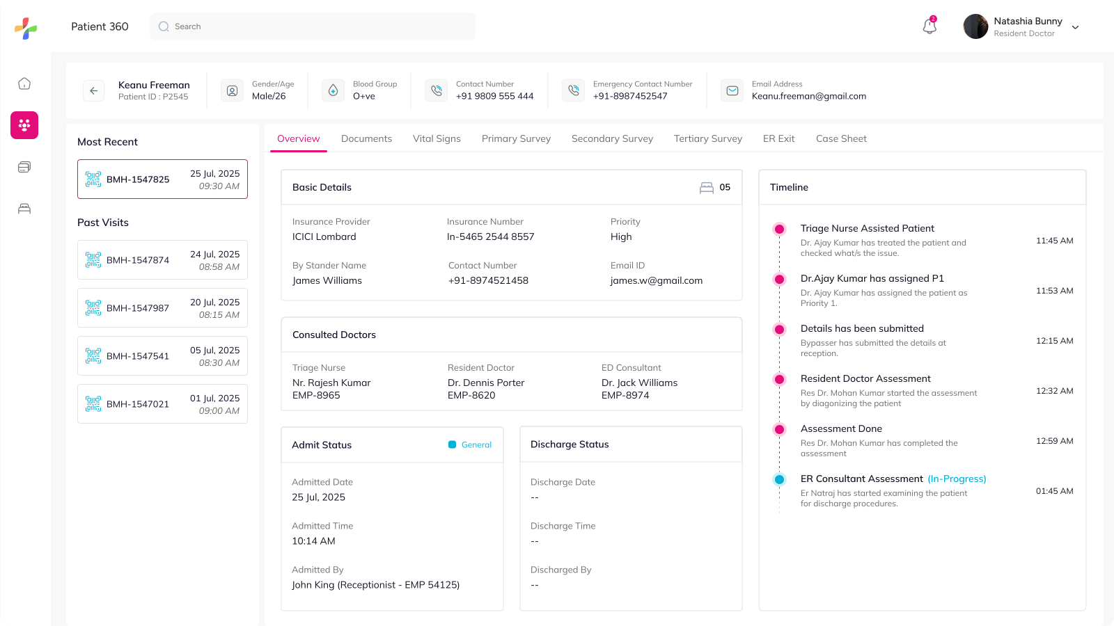
Overview

The Overview section gives a quick snapshot of the patient's current status, assigned medical staff, admission details, and activity timeline in one place.

💡 This helps doctors understand the patient journey and current progress at a glance.
Patient 360 overview

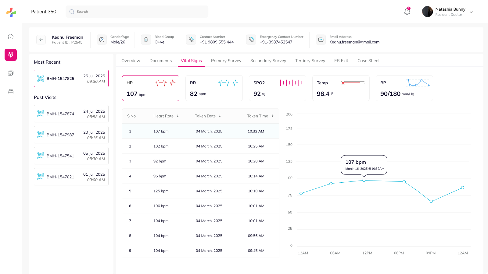
Vital Signs

The Vital Signs section visualizes important health metrics such as heart rate, BP, temperature, and oxygen levels through structured data and graphs.

💡 Visualizing vitals over time makes it easier to identify abnormalities and monitor patient stability quickly.
Patient 360 vital signs

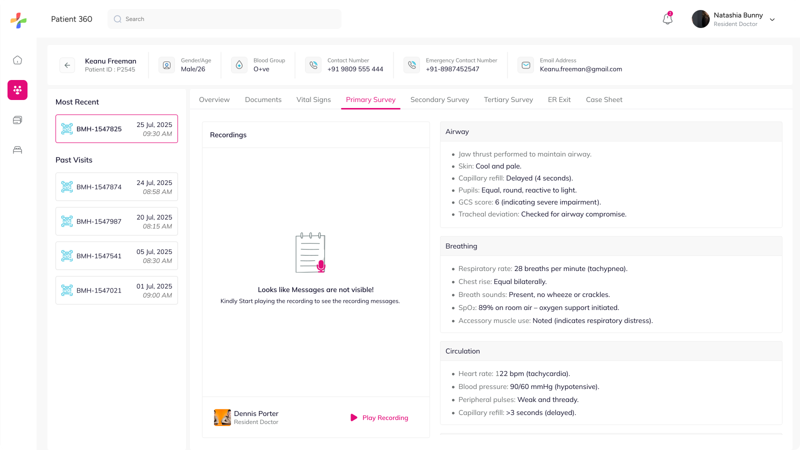
Primary Survey

The Primary Survey captures the patient's immediate critical condition assessment, including airway, breathing, and circulation details.

💡 The layout was designed to keep emergency findings structured, scannable, and easy to review under pressure.
Patient 360 primary survey

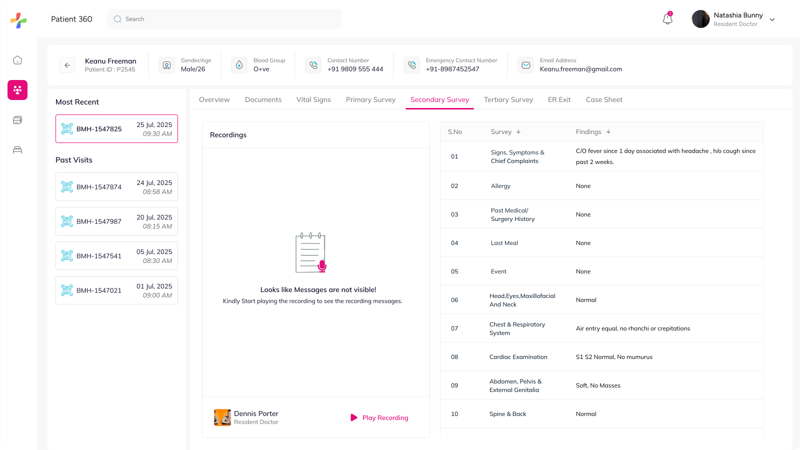
Secondary Survey

The Secondary Survey documents detailed clinical findings, symptoms, medical history, and physical examinations in a structured format.

💡 Organizing findings systematically helps doctors review patient conditions faster and reduce documentation friction.
Patient 360 secondary survey

Tertiary Survey

The Tertiary Survey consolidates prescriptions, procedures, and lab reports into a unified view for continued treatment and follow-up care.

💡 Bringing all treatment-related information together improves accessibility and reduces dependency on fragmented records.
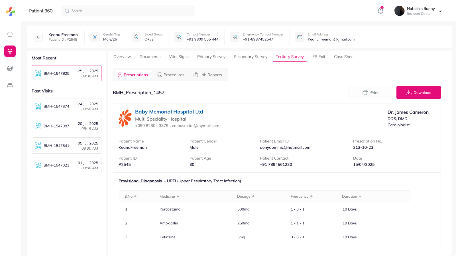
Patient 360 tertiary survey

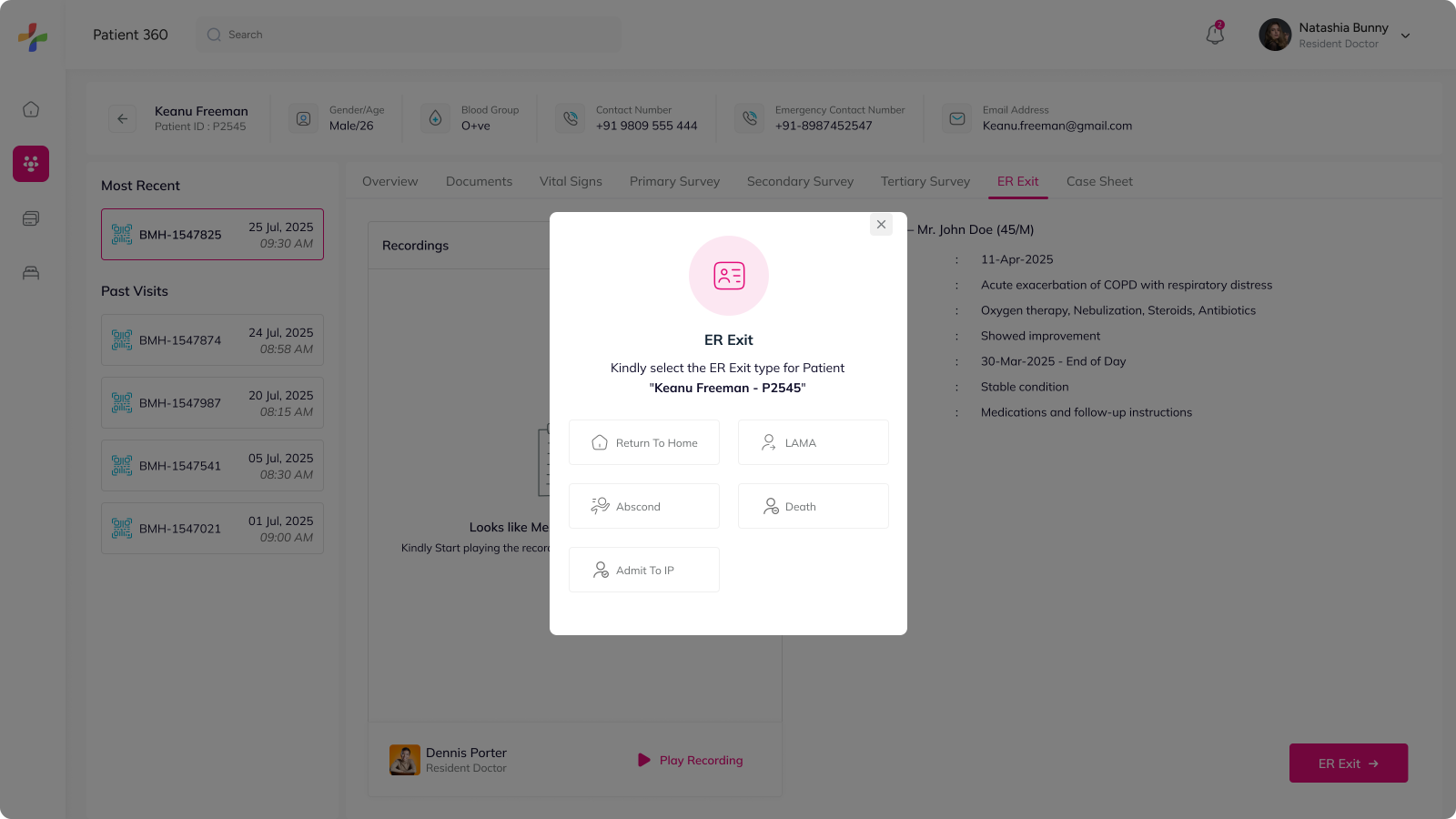
ER Exit

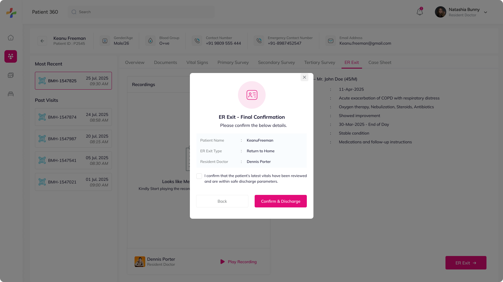
The ER Exit flow was designed to streamline discharge-related decisions with clear confirmation steps and predefined exit outcomes.

💡 Adding structured validations and confirmation checkpoints helps reduce errors during patient discharge workflows.

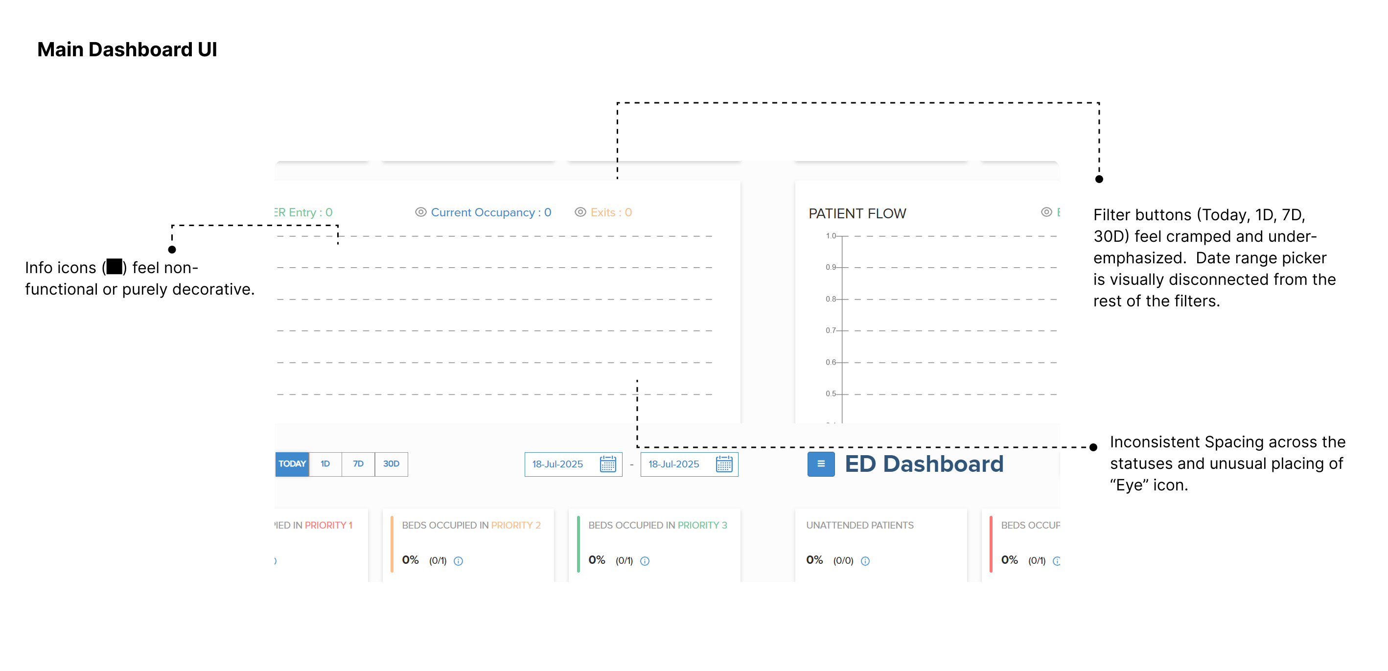
ER exit flow screen 1ER exit flow screen 2

Conclusion

Working on ER Management system was both a challenging and rewarding experience. Throughout the process, I explored multiple directions, faced design trade-offs, and kept iterating until the workflows felt right for the high-pressure environment of an Emergency Room.

💡 A good design in healthcare isn't just about looking better — it's about making care faster, safer, and more reliable.

The impact of the redesigned ER system was reflected not only in stakeholder feedback but also in measurable improvements:

  1. Reduced cognitive load for doctors and nurses by streamlining patient triage and follow-up tasks.
  2. Improved coordination across roles (nurses, residents, and admins) with consistent, role-specific interfaces.
  3. Configurable modules made it easier for hospitals to scale and adapt the system without heavy redesign or dependency on the product team.

This project reinforced my belief that design in healthcare must focus on clarity, speed, and trust.

Hope you found this case study insightful!

I'd be happy to connect and discuss more — feel free to reach out.