Real-Time Clinical Intelligence for Live Medical Consultations
How did we identified the Problem?
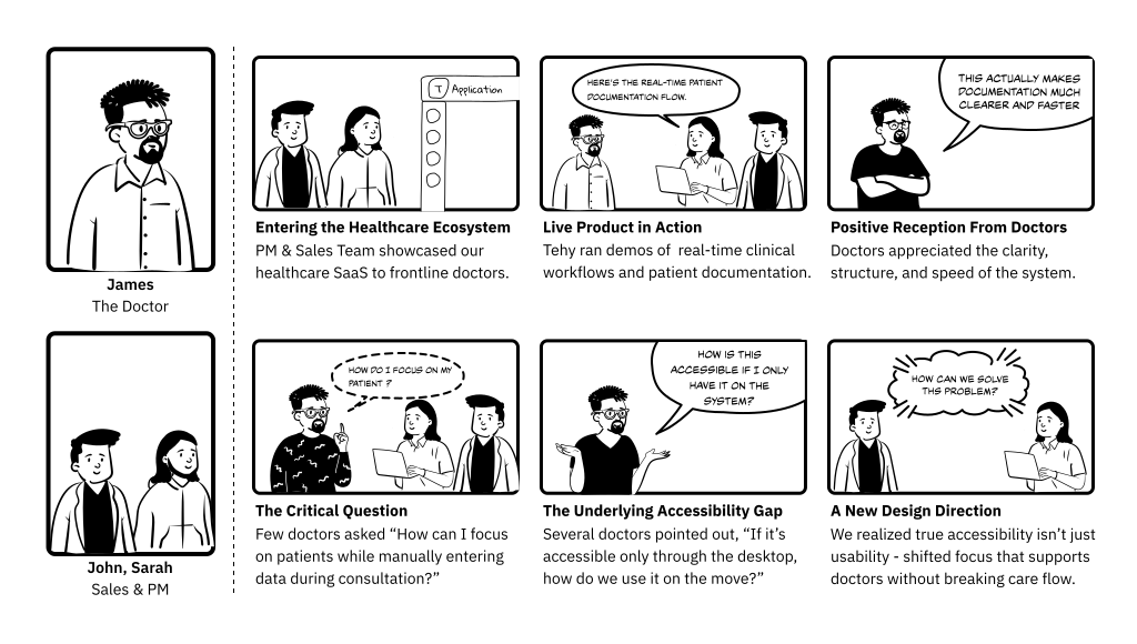
At first, the product seemed to solve the problem.
The demos went well. Doctors were interested. Stakeholders were excited. But once the conversations became deeper, a different reality started showing up.
Doctors weren't always sitting in front of systems. Consultations happened while walking through wards, during home visits, between emergencies, and in environments where documenting everything in real time simply wasn't practical.
Most of them had already adapted to the chaos. Managed conversations and documentation at the same time.
And slowly, we realized:
The problem wasn't the absence of software.
The problem was that the workflow itself was mentally exhausting.
Core problems
Doctors had to talk and document at the same time
During live consultations, doctors were listening, asking questions, observing symptoms, and taking notes simultaneously. This constant multitasking could interrupt the flow of conversation and increase the chances of missing important clinical details.
Existing systems weren't built for real-world consultations
The web platform worked well in controlled environments, but real consultations happened during ward rounds, home visits, and between back-to-back patients — where quick and accessible documentation became difficult.
Too much cognitive load during consultations
Doctors constantly switched between patient interaction, clinical thinking, and documentation. Managing all of this together increased mental fatigue and made consultations harder to handle efficiently.
What Was Slowing Doctors Down
Real-time documentation was difficult
Doctors had very little time to pause during consultations. Capturing accurate information while actively engaging with patients became mentally demanding.
Accessibility was limited to desktop workflows
Although a web platform existed, it wasn't practical during mobile consultations, home visits, or fast-moving hospital environments.
Consultations demanded constant context switching
Doctors had to move between listening, analyzing symptoms, recalling patient history, and documenting information — all within a few minutes.
What Happened During Live Discussions
During stakeholder meetings and live demos of our web platform, doctors showed strong interest in the product's capabilities. However, several critical questions emerged around accessibility, mobility, and real-world usage.
Questions Raised by Doctors
- We spend a lot of time outside the hospital. How do we access during home visits?
- Can this work on mobile when we're not near a desktop or workstation?
- Can I start a consultation on the go and sync to our EMR?
- How fast can I record and retrieve patient details between back-to-back visits?
Insight Gained
While the web version demonstrated strong value, doctors clearly expressed the need for a mobile-first, context-aware solution that fits into their real working conditions—not just hospital environments.
It's KYC time….KYC = Know Your Customer!
To move beyond assumptions and stakeholder-level feedback, one-on-one interactions with doctors has been conducted to understand their real workflows, pain points, and expectations during day-to-day consultations.
How We Conducted the Interviews
- Spoke with doctors across multiple specialties.
- Included physicians who regularly perform home visits and on-the-go consultations.
- Focused on real scenarios, not ideal workflows.
- Asked open-ended questions around documentation, tools, and decision-making.
Questions We Explored with Docs
- How do you currently document consultations outside the hospital?
- At what point do you usually enter notes into the EMR?
- What challenges do you face while documenting during live consultations?
- How comfortable are you using digital tools while talking to patients?
- What would an ideal tool look like during a real consultation?
Designing the Right “How Might We's
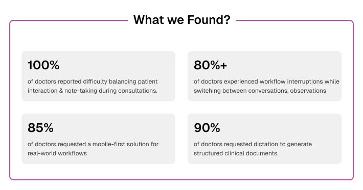
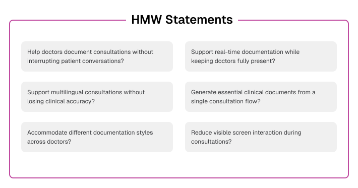
Based on insights from doctor interviews, stakeholder discussions, and observed workflows, we reframed the challenges into clear design questions. These “How Might We” statements helped us shift from understanding problems to exploring meaningful design opportunities—guiding decisions throughout the mobile experience.
Who are we fighting?
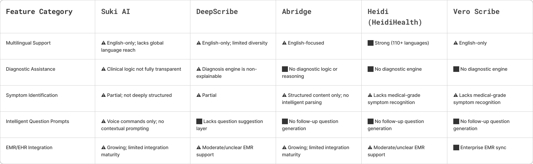
Since this was a B2B product, I couldn't just download competitor apps and test them, as most required login credentials and weren't publicly accessible. However, I still conducted a feature-level analysis of similar tools based on:
- App Store descriptions and screenshots
- Documentation, demo videos, marketing sites
- User reviews and customer feedback posts
How the Solution Started Taking Shape
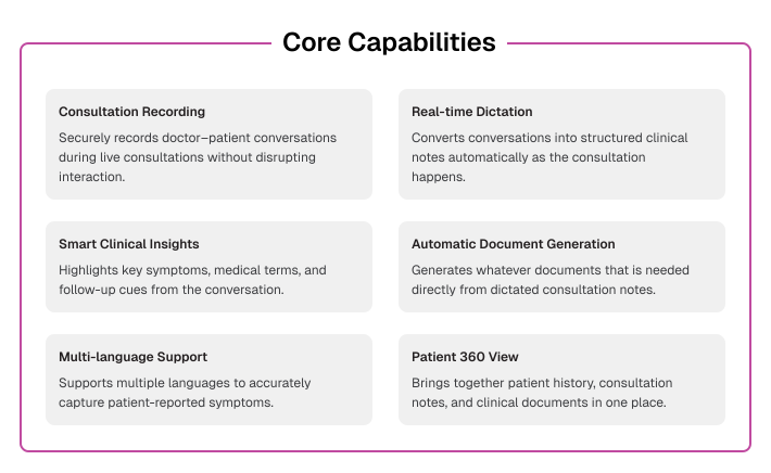
Features are designed to support doctors during live, mobile consultations. Each feature focuses on reducing documentation effort, minimizing cognitive load, and ensuring accurate clinical capture - without interrupting patient interactions.
Creating a Flow That Felt Natural
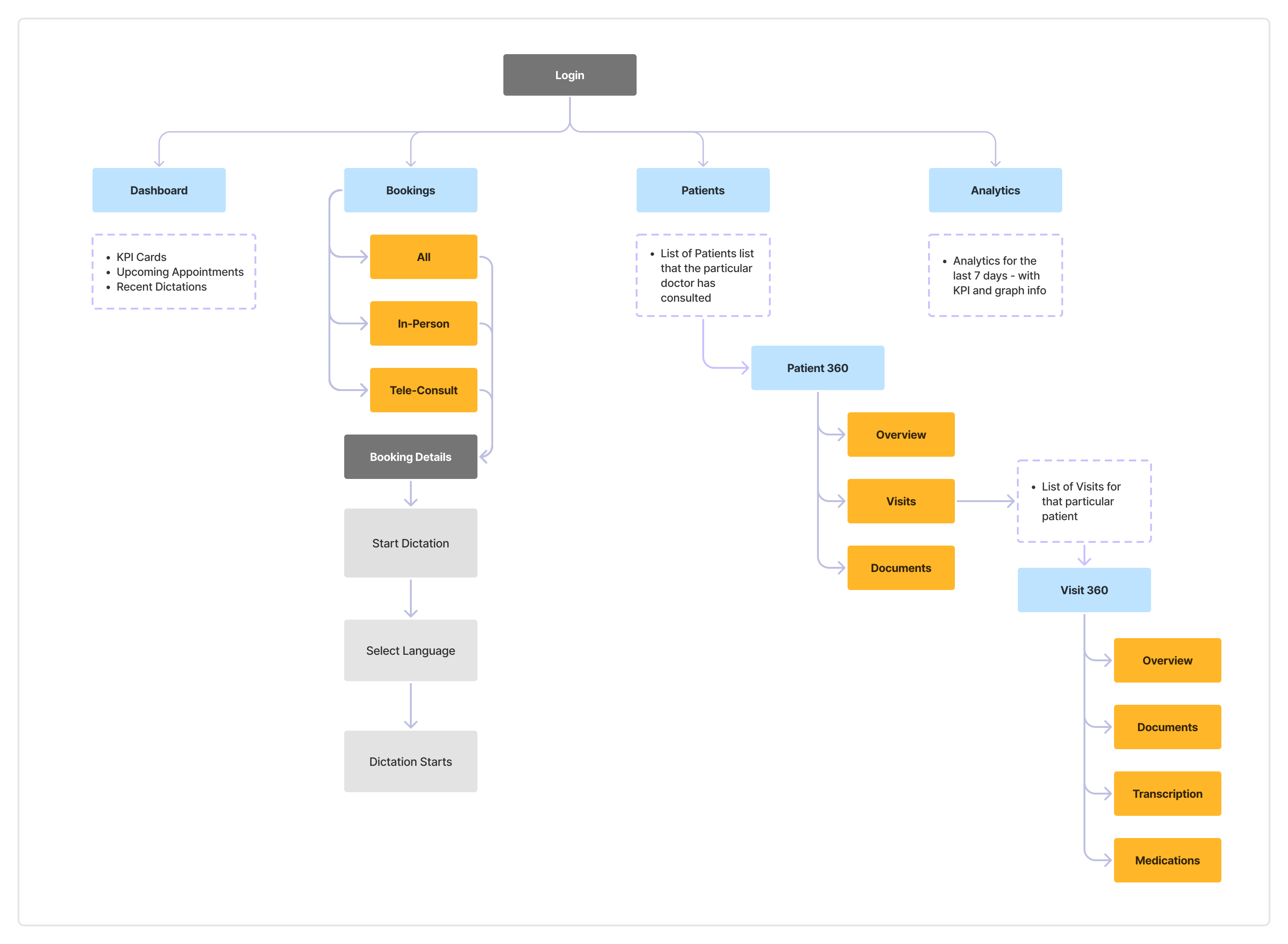
The information architecture was designed to keep critical actions easily accessible during live consultations. Content and features are organized around doctor workflows, ensuring quick navigation, minimal cognitive load, and seamless transitions between recording, documentation, and patient records - especially in mobile, time-sensitive contexts.
Finding the Right Visual Rhythm
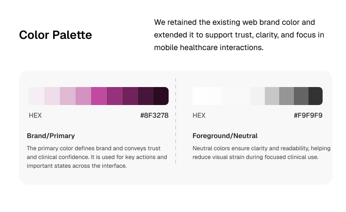
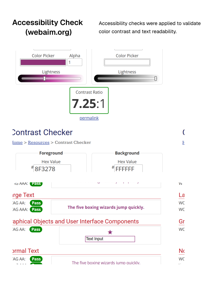
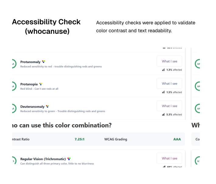
We needed a good rhythm & scalability of the product. Hence, we chose what gave us the most flexibility and aligned with the brand value.
Building the Workflow Step by Step
To make workflow easier, we categorize the solution into 4 phases:
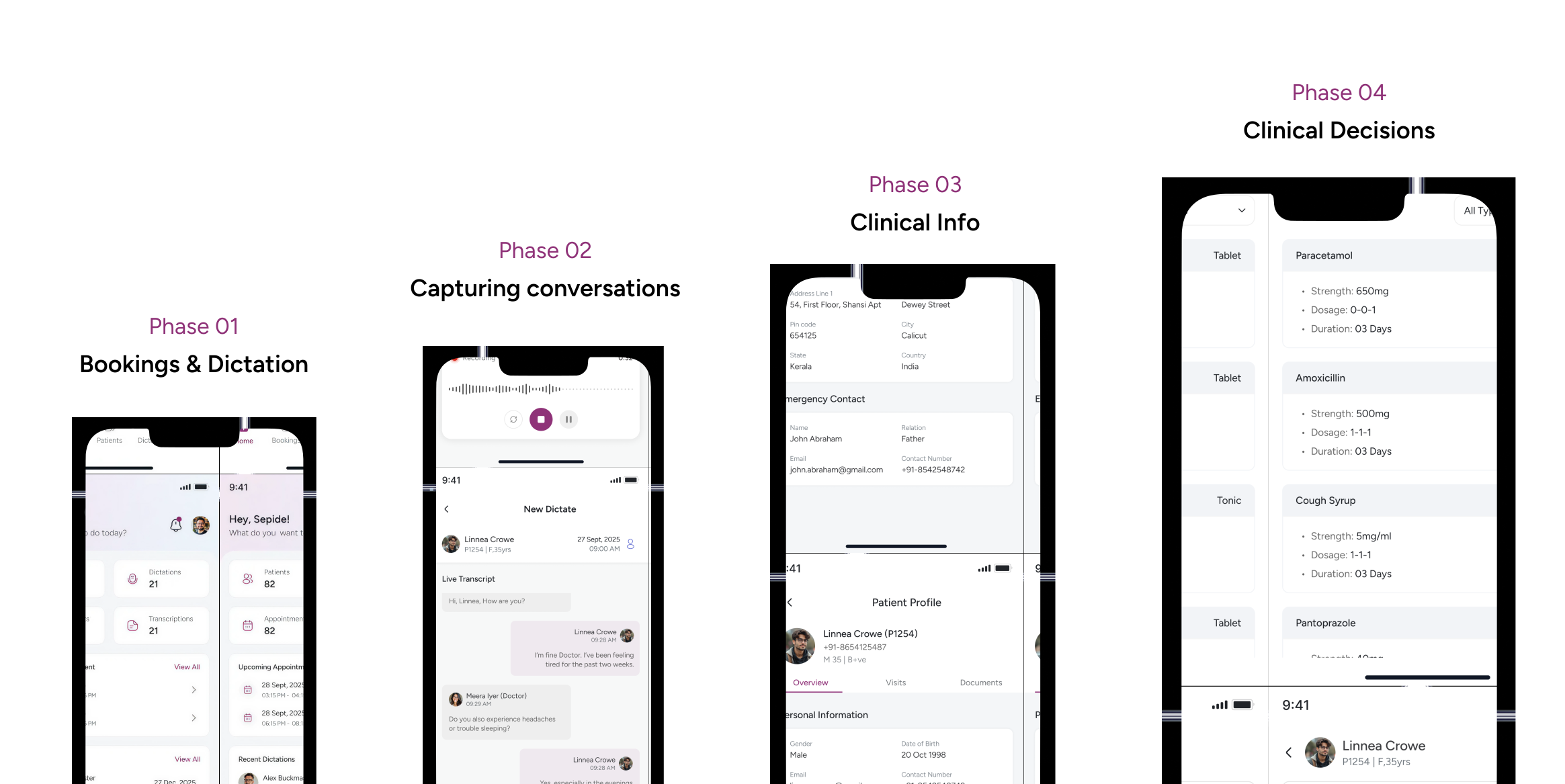
Phase 01 : Bookings & Dictations
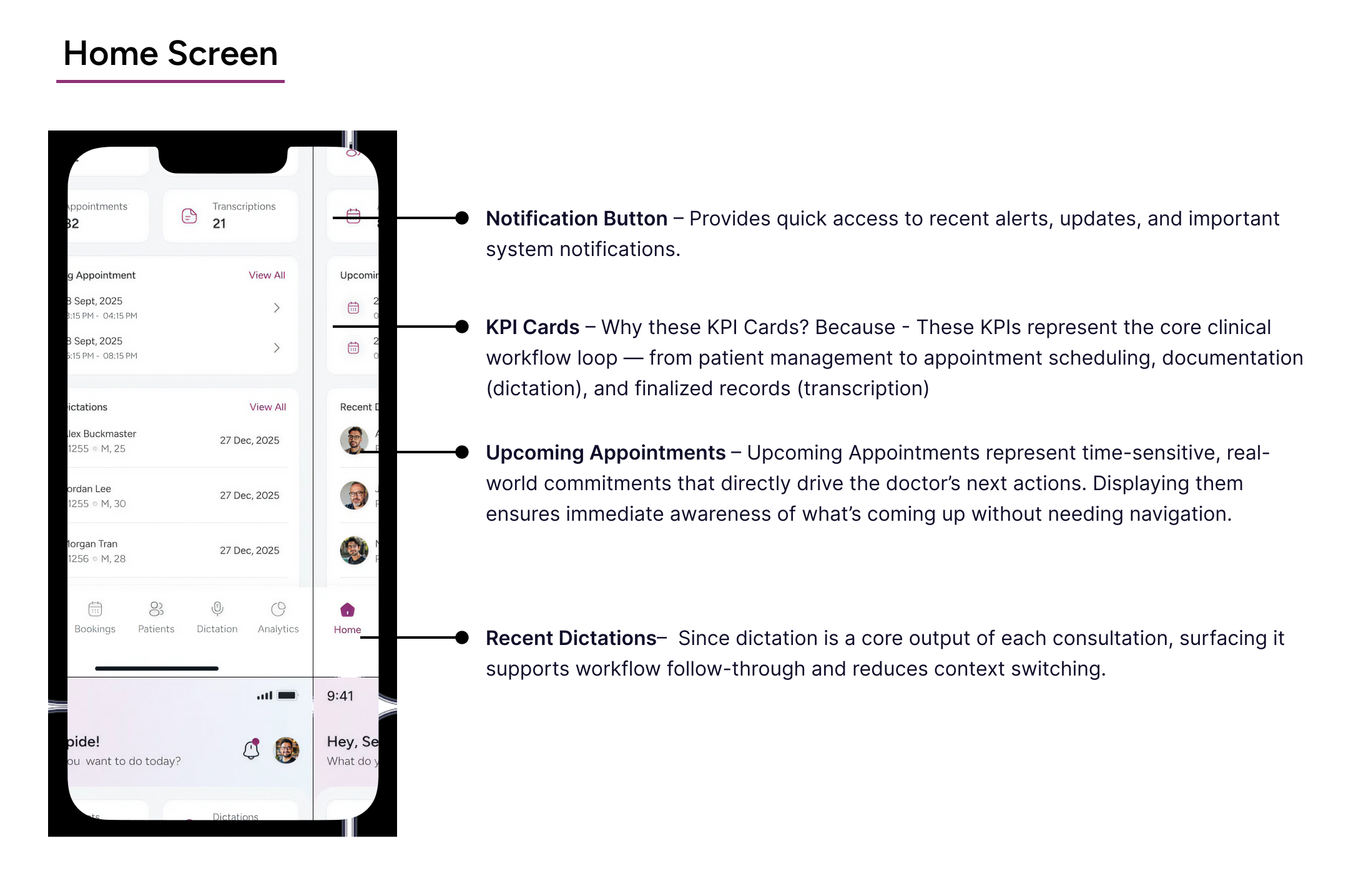
Doctors often move between multiple consultations with very little time in between. The homepage was designed to reduce that initial friction by surfacing upcoming appointments, recent activity, and quick actions in one glance — helping doctors immediately continue where they left off.
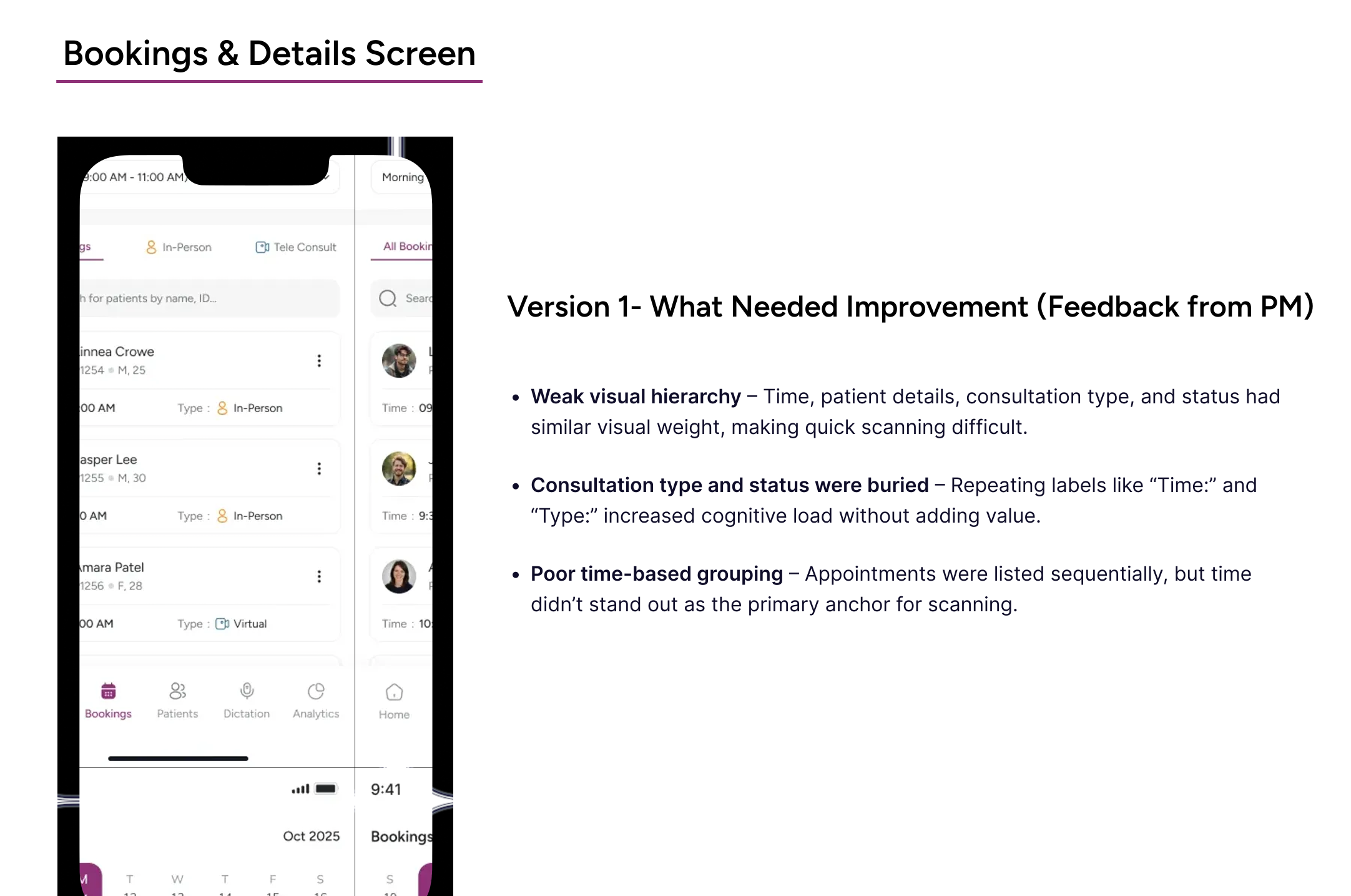
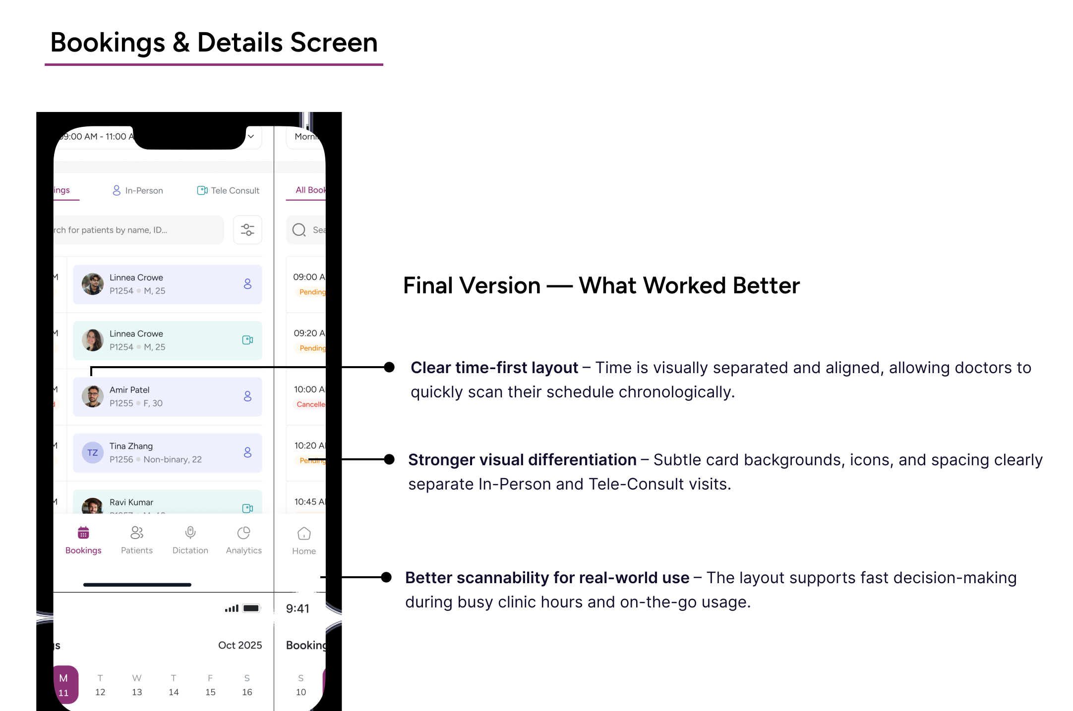
Managing consultations wasn't just about viewing appointments. Doctors needed a faster way to understand what's coming next, prepare quickly, and move between consultations without unnecessary cognitive effort. The experience was designed to make upcoming consultations feel easier to scan, prioritize, and access during busy schedules.
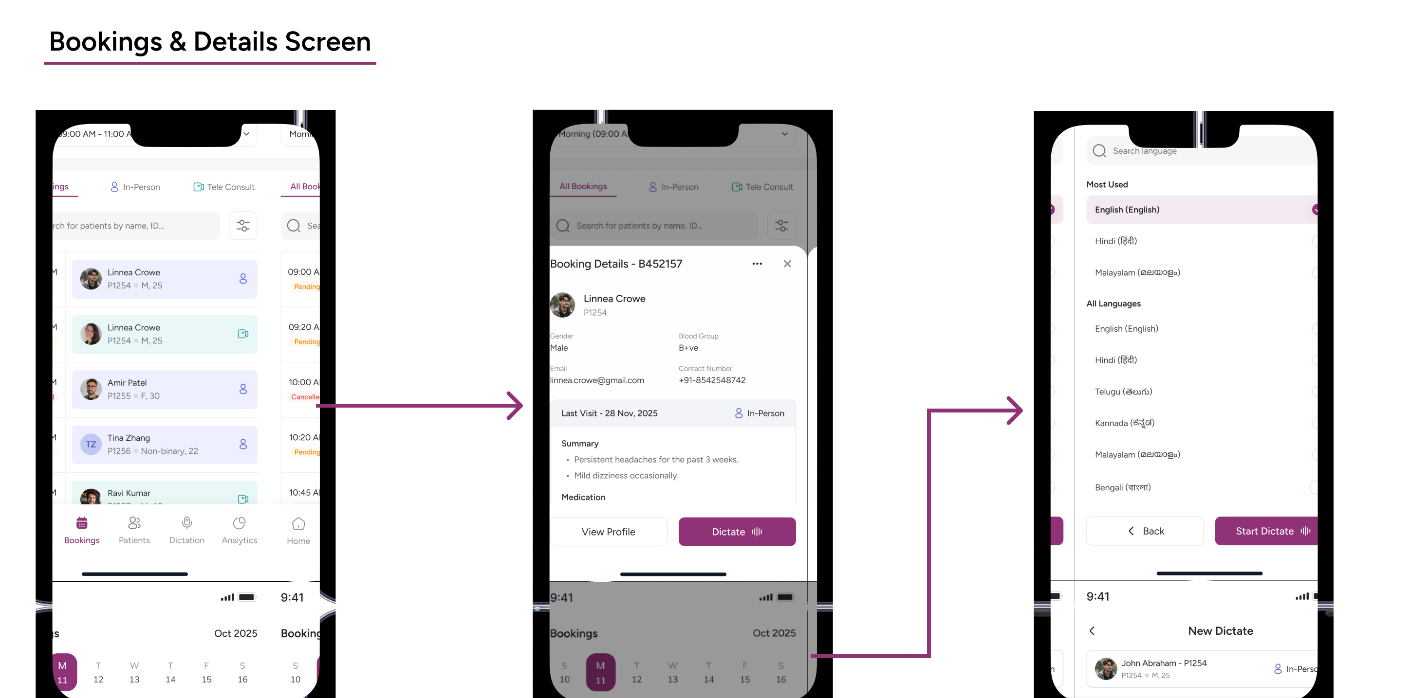
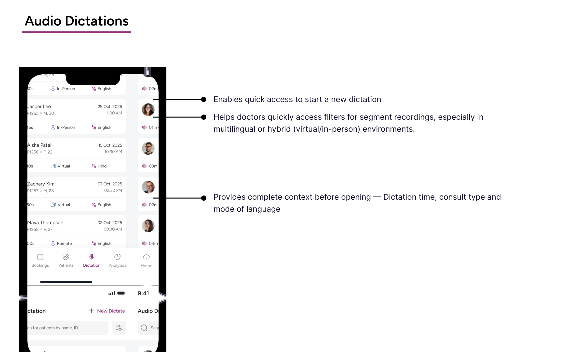
As consultations kept increasing throughout the day, doctors needed a simple way to revisit previous recordings without searching through fragmented workflows. The dictation experience was designed to make past consultations easier to access, review, and continue whenever needed.
Phase 02 : Capturing Conversations
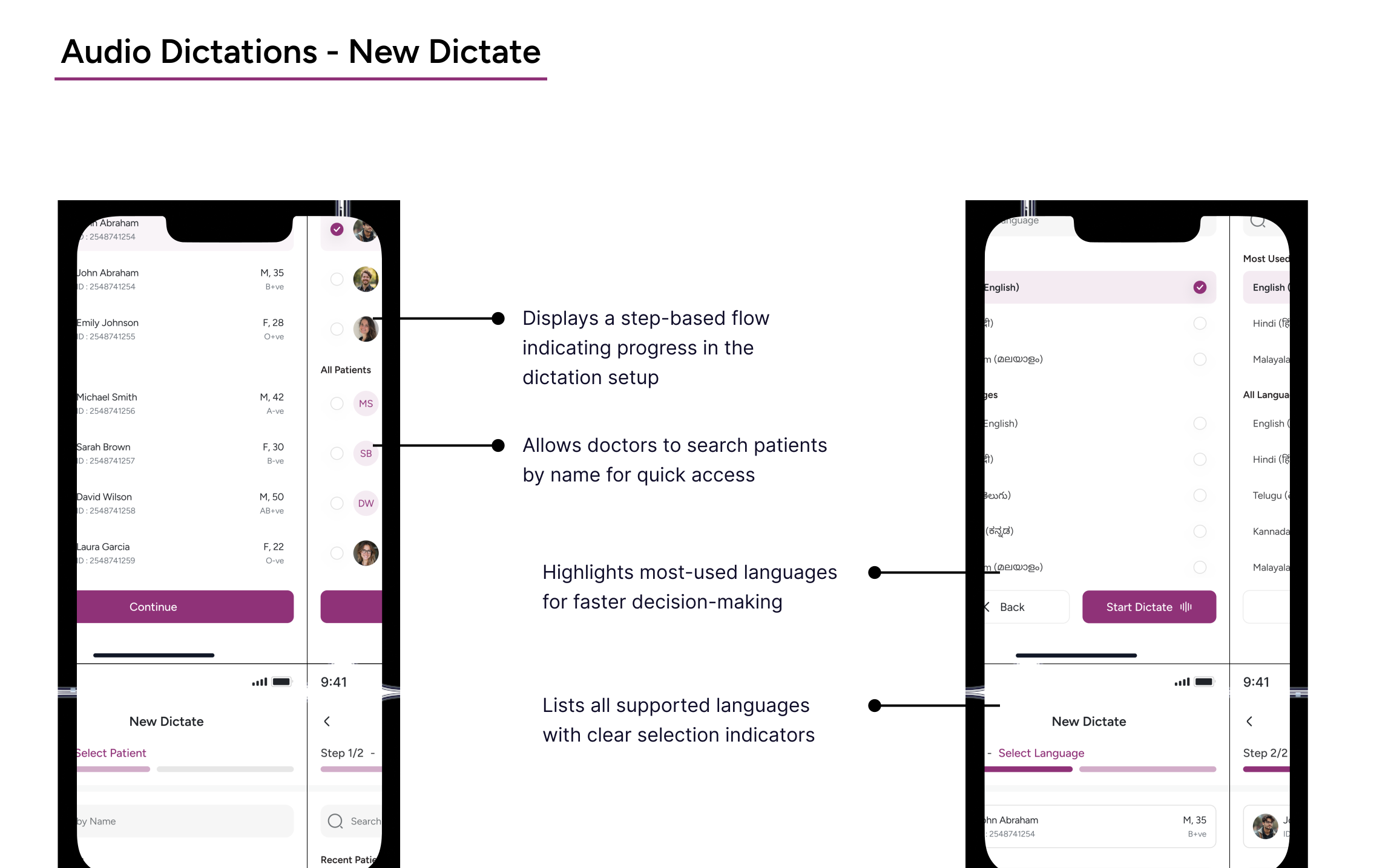
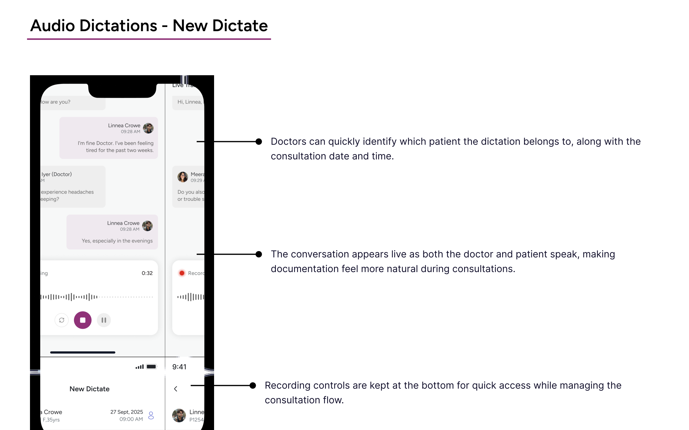
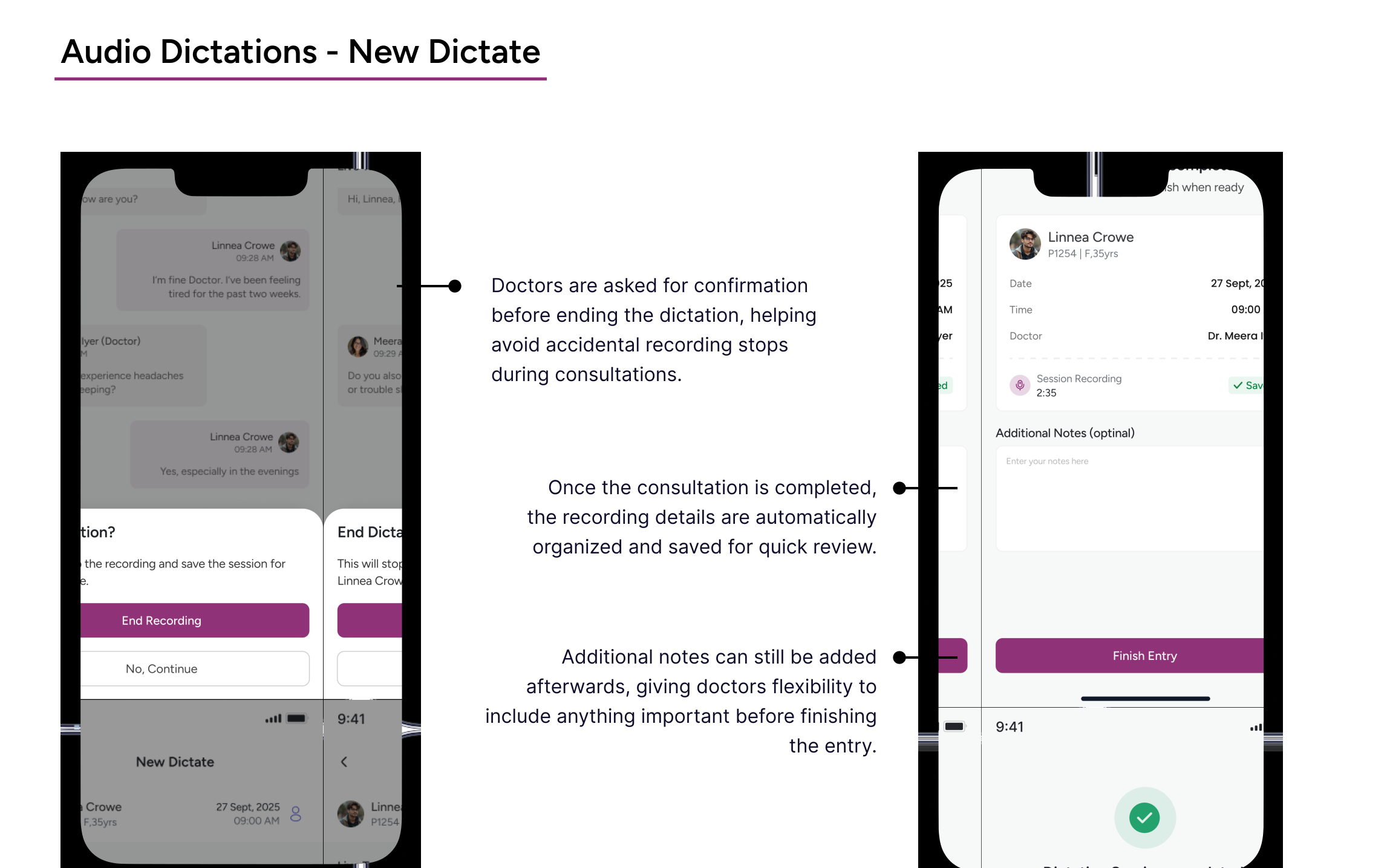
This flow guides doctors through starting a new dictation in a simple, step-by-step manner. It ensures the right patient and language are selected before recording begins, reducing errors and setup time.
Purpose of New Dictate
The New Dictate flow is designed for scenarios where doctors need to capture clinical conversations without a scheduled booking – such as emergency consultations without bookings. This ensures documentation remains flexible and accessible even outside the standard appointment workflow.
Phase 03 : Clinical Info
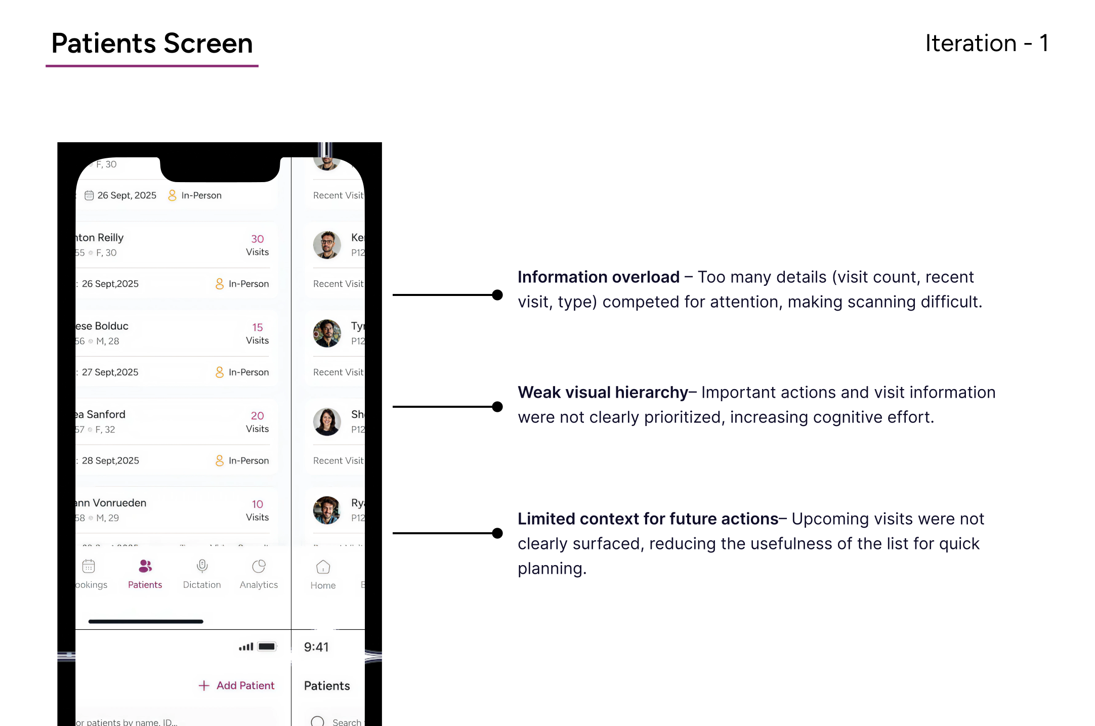
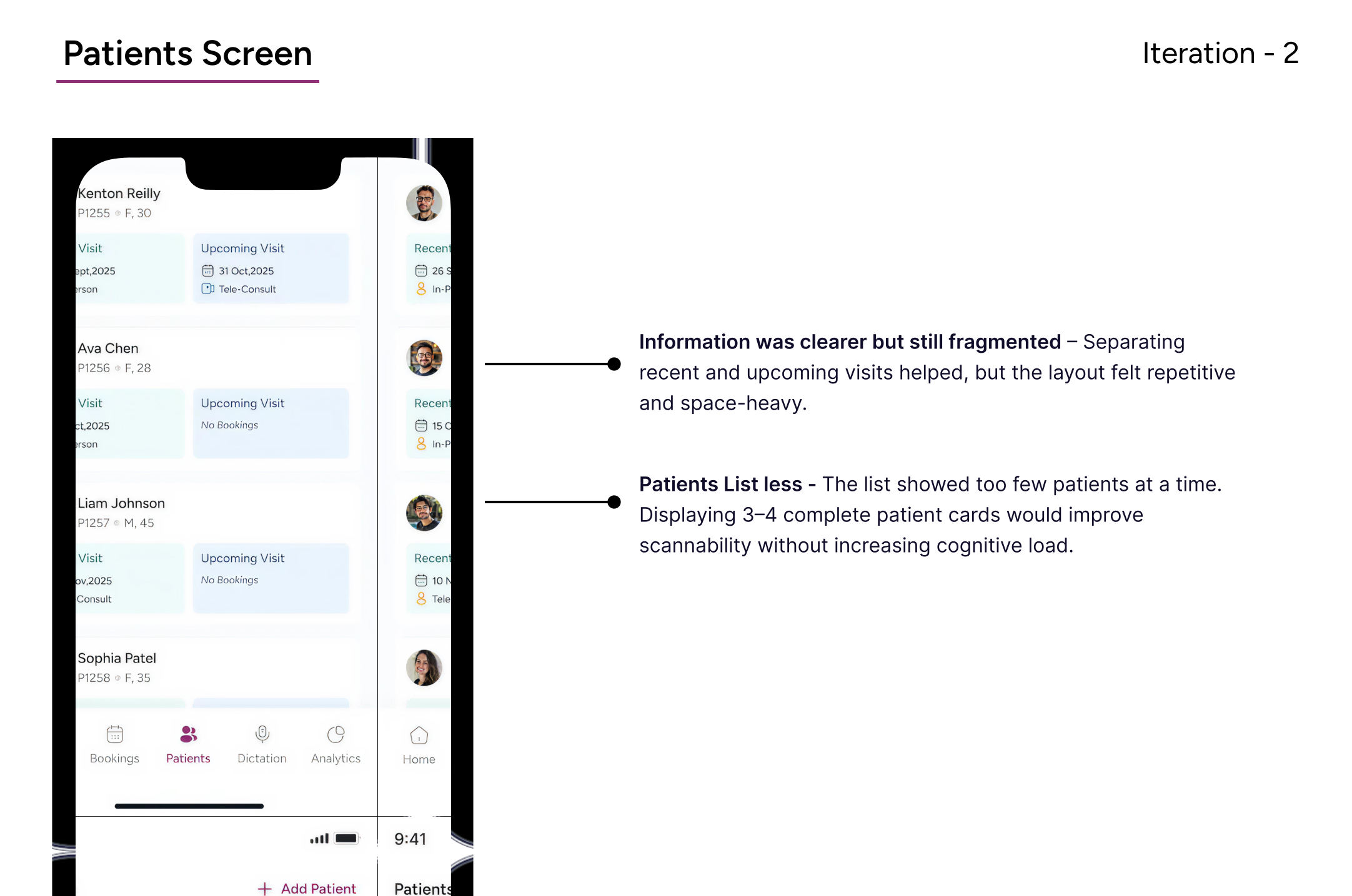
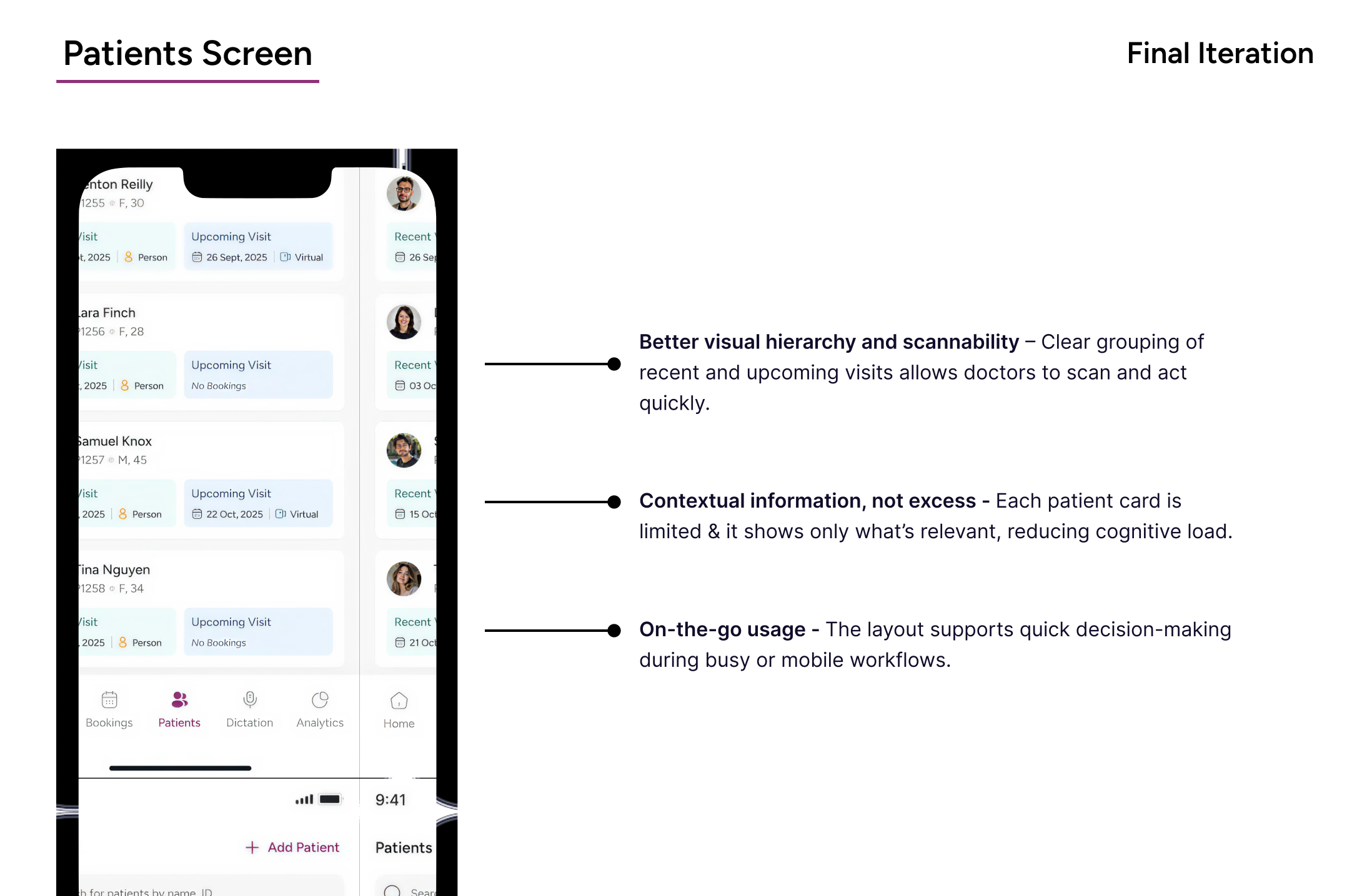
The patients list offers a structured and scannable overview of all patients, allowing doctors to quickly search, identify, and access patient profiles. It balances information density with clarity for fast navigation.
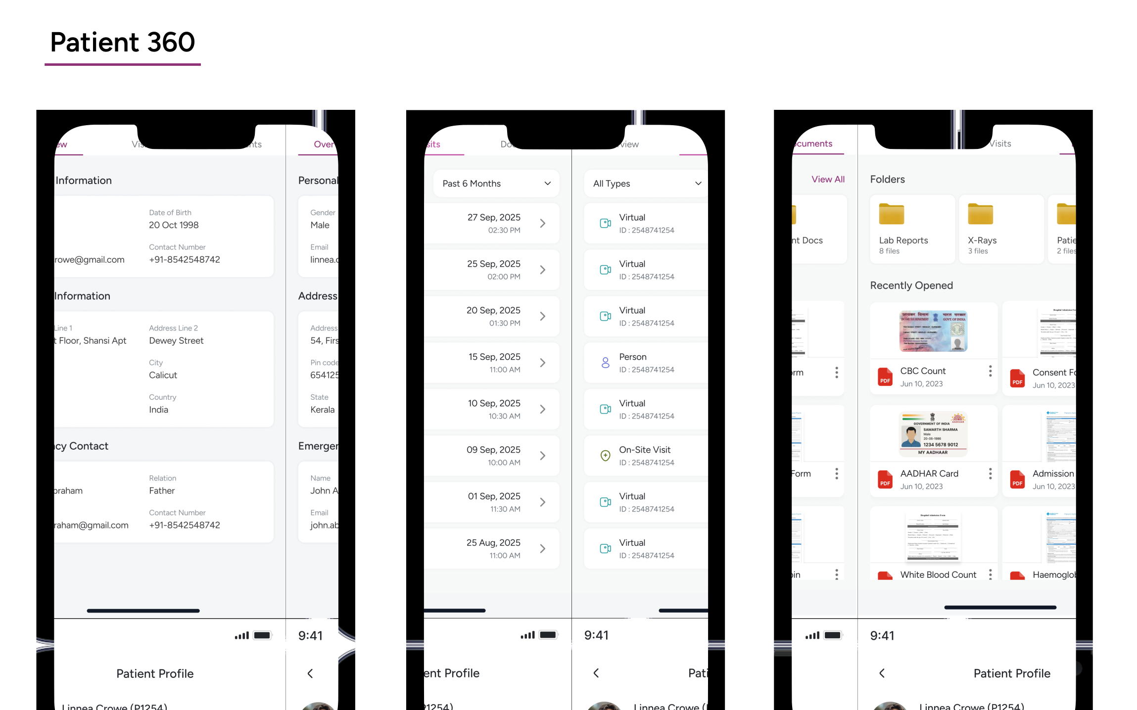
During consultations, doctors needed a quicker way to review patient history and related records without constantly navigating across different sections. Patients 360 was designed to keep everything connected and easier to access in one view.
Phase 04 : Clinical Decisions
This module focuses on a specific consultation, organizing clinical details into clear sections. It supports review, documentation, and follow-ups by presenting structured medical data derived from the visit.
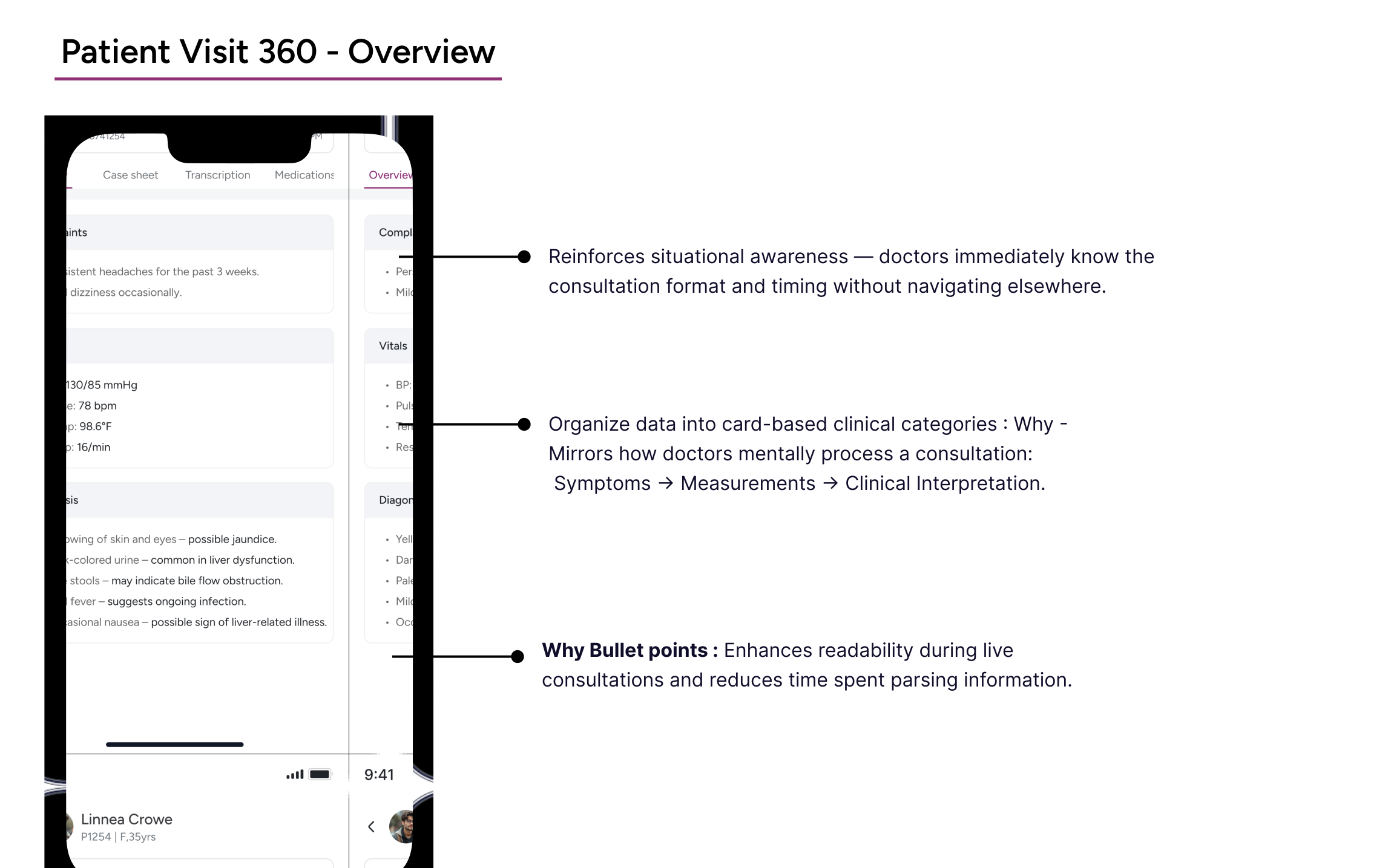
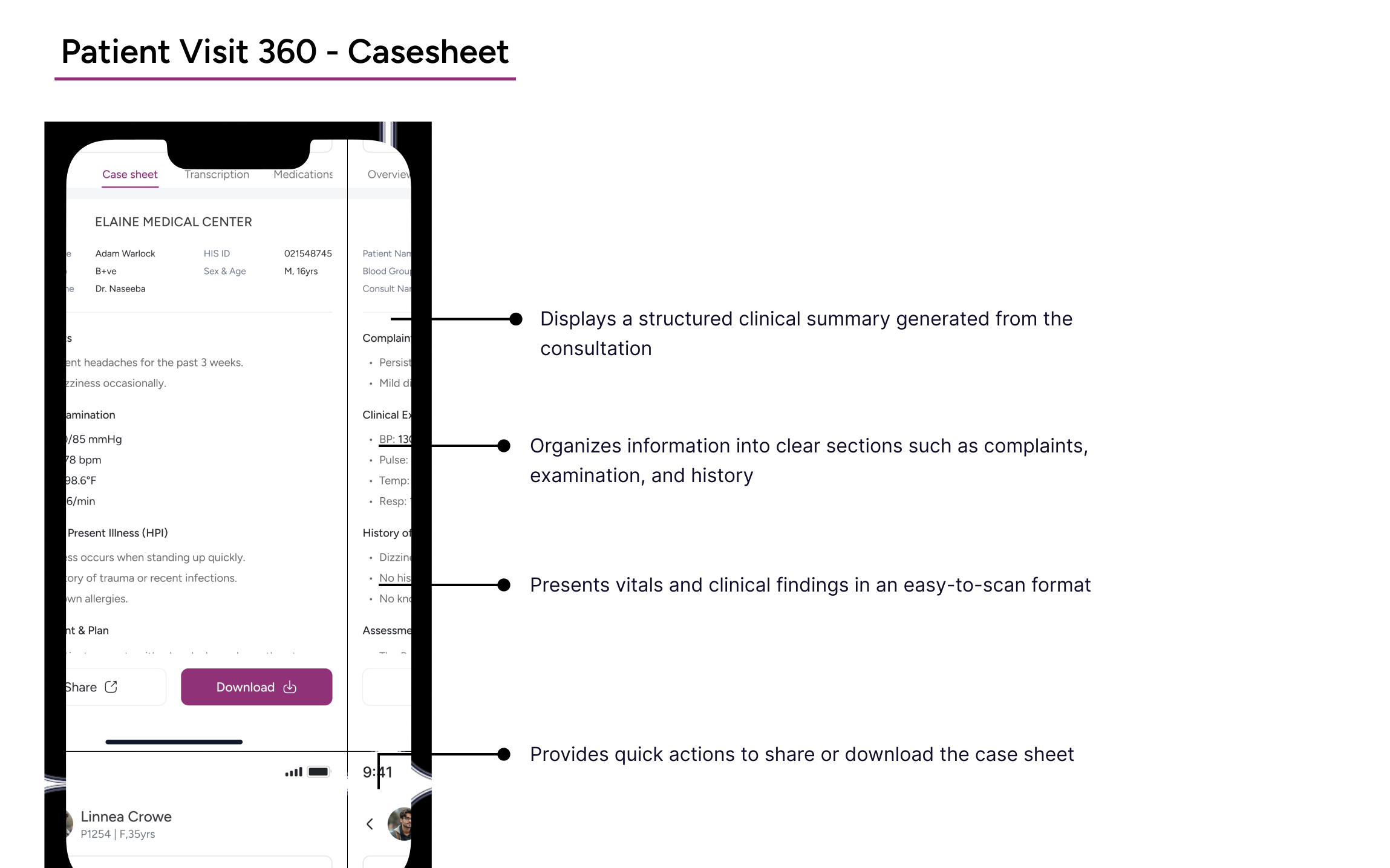
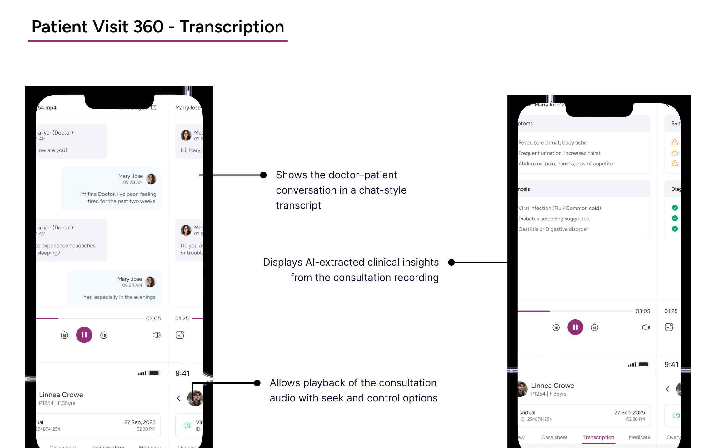
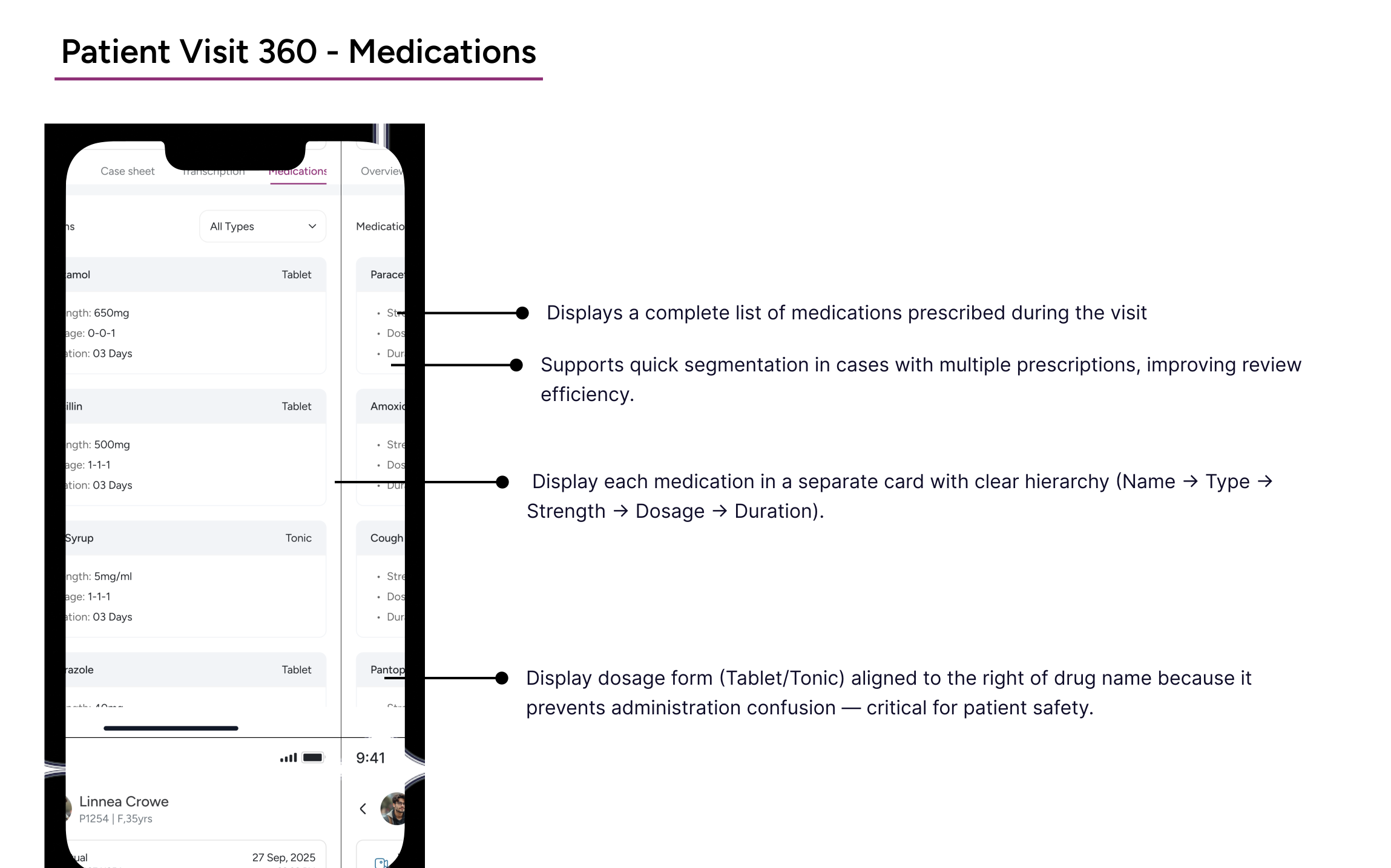
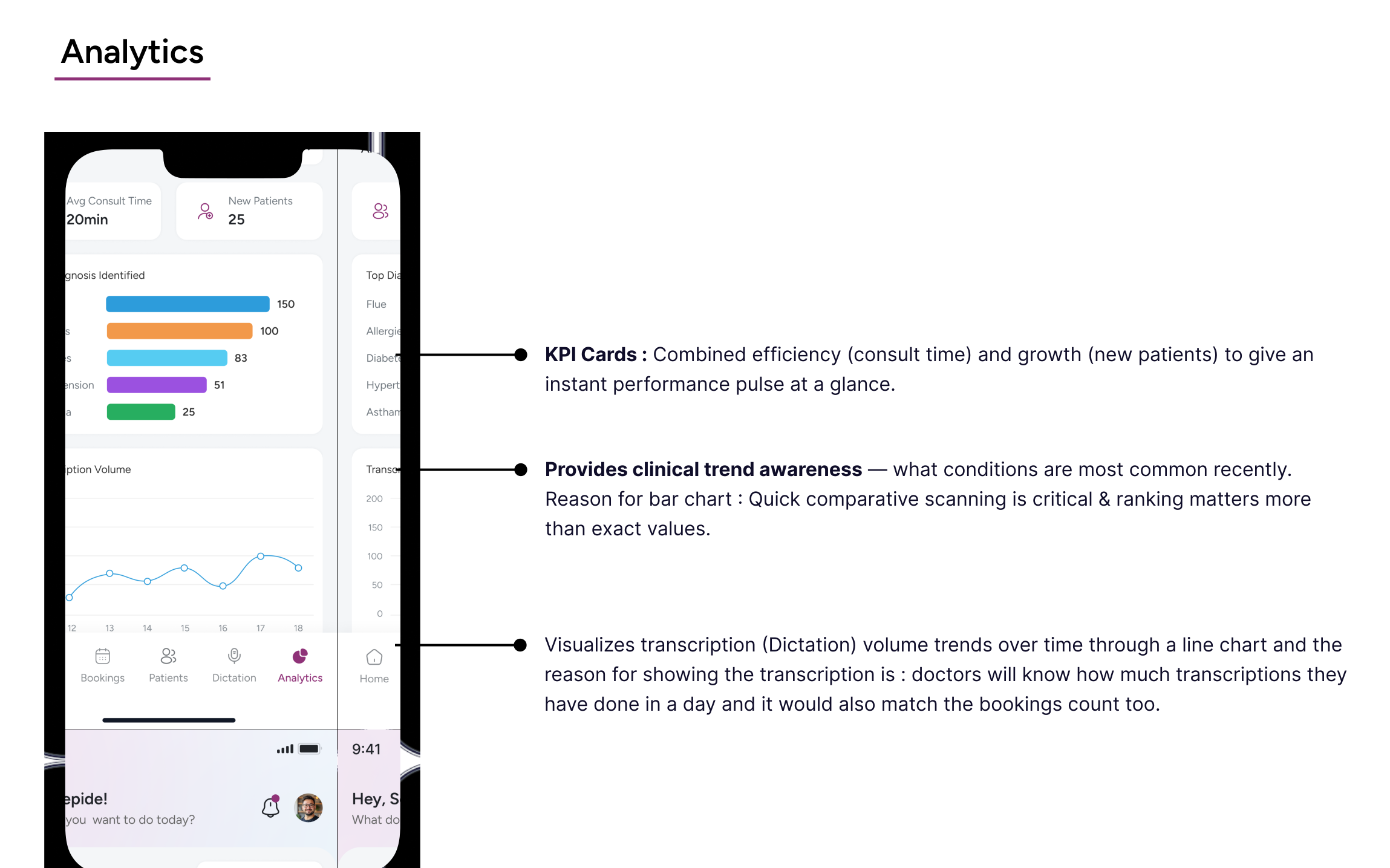
The analytics flow was designed to give doctors a clearer overview of their consultations and dictation activity, helping them review information faster without adding extra complexity.
A Hard Lesson on Responsive Design
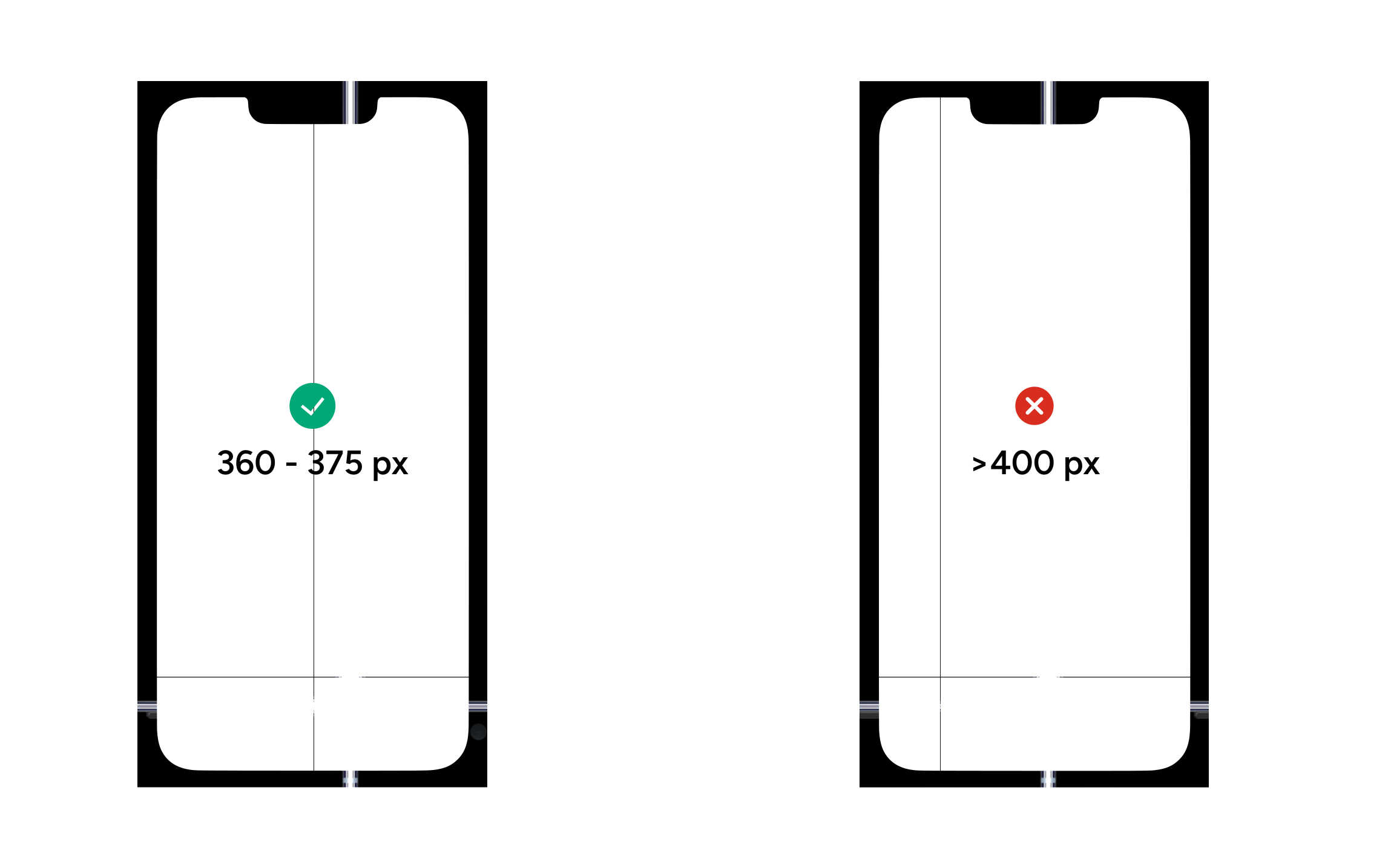
I initially designed the app using a 430px width. Visually, everything felt spot-on. However, once the build was tested across other devices, the typography appeared noticeably oversized. This raised concerns, so I reached out to the mobile development team for clarity.
This pushed me to revisit platform best practices. Through further research and community discussions, I learned that 360x800 is commonly used as a base screen size, particularly for Android devices. In fact, many designers recommend working within the 360-375px range to achieve better consistency and compatibility across a wide variety of devices.